How to Overcome Your Fear of Color: Spring Palette
Like it or not, you’re going to be seeing a lot more color in home design this year. Neutrals are making room for the transition, from soft shades to bold hues and everything in between. If you’ve always been a neutral gal, you can learn to overcome your fear of color by easing into it with a soft spring palette. Today’s collection from The Little Green Paint Company can show you how.
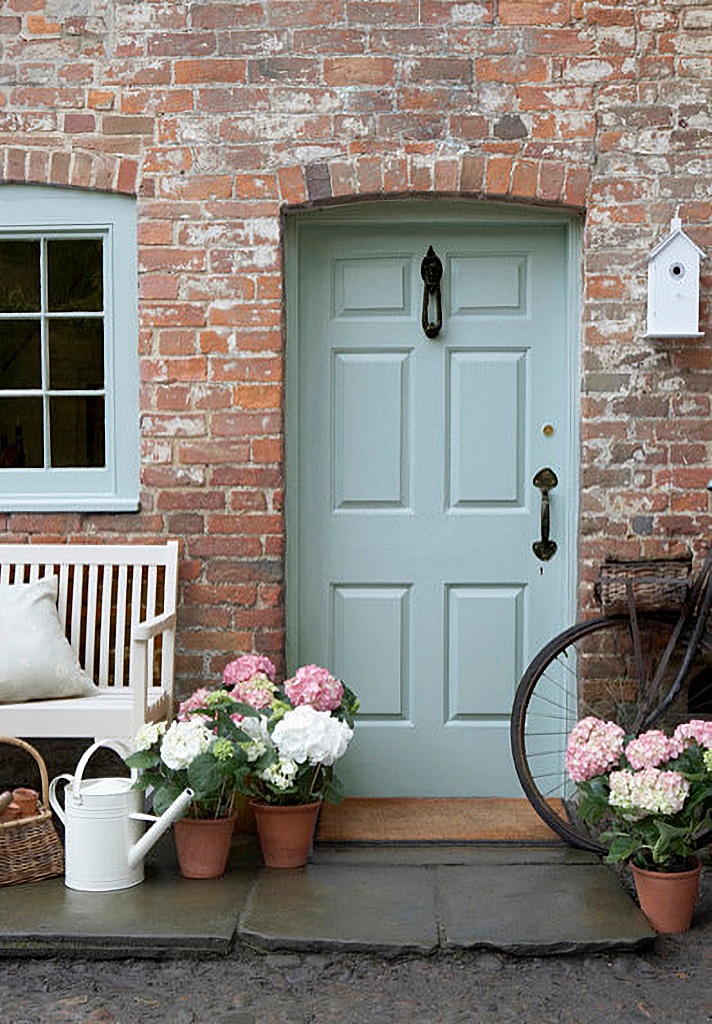
Start with the first thing that people see when they visit your home – the front door. Celestial blue adorns both the door and the window trim on this cozy brick cottage. It’s an easy change to make.
 By The Little Greene Paint Company Manchester
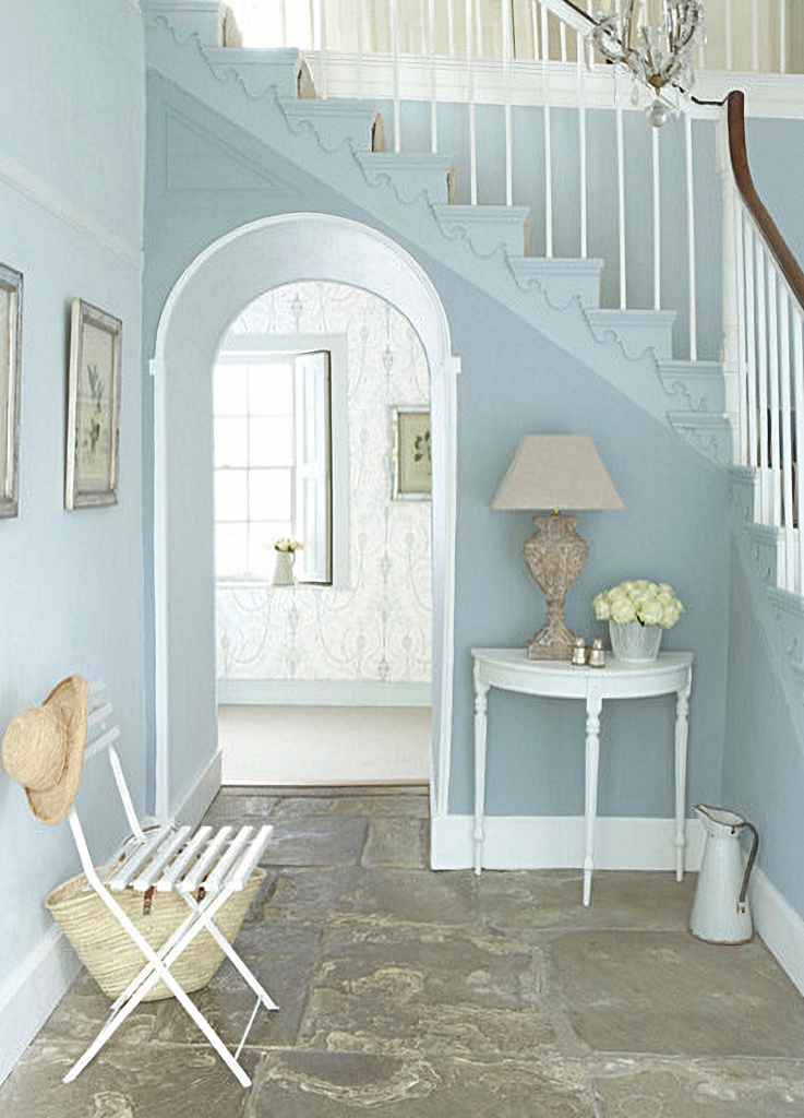
A calming entryway gets a dusting of Bone China Blue. Pale blue is a great color to pair with beige or white in your home. The looks is fresh and sophisticated.
 By The Little Greene Paint Company Manchester
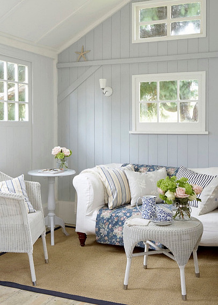
A spring palette is perfect for a shabby chic style room with slipcovered furniture and print fabrics. The back wall is painted Gauze Dark (a shade of gray) while the left wall is painted a paler shade of the same hue. The touch is light and peaceful – perfect for dipping your toe into the world of color.
 By The Little Greene Paint Company Manchester
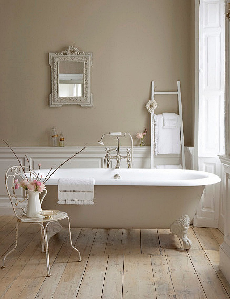
Slightly bolder but still sporting a spring palette, a darker shade of blue is perfectly married to pink in an old-fashioned bathroom. Note how the ceiling is off-white as opposed to pure white. Going with an off-white paint choice is a good way to calm colors done if you’re a little fearful of them.
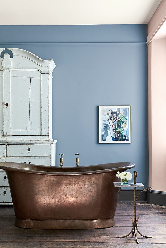 Photo by The Little Greene Paint Company
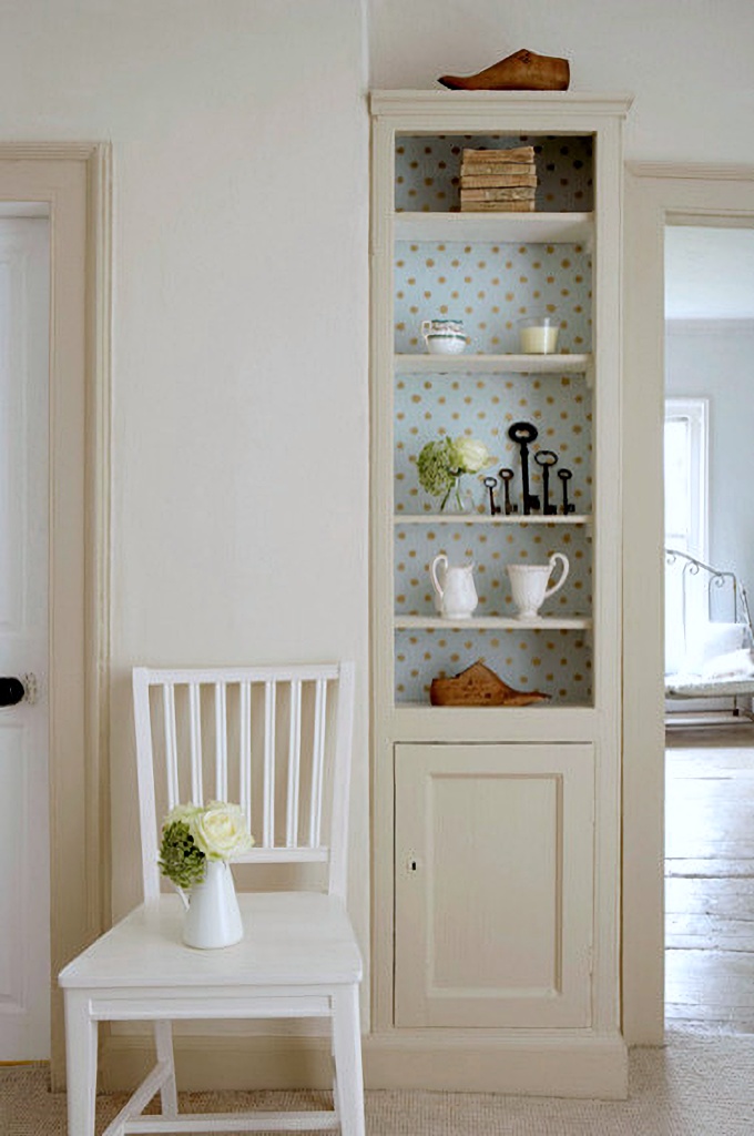
Creamy walls pair with a pale tan trim in the hallway. The pop of color is shown in the wallpaper lining the small bookcase. You can get the same result with peel-and-stick wallpaper sheets from J.Campbell Design. The sheets are smaller than standard wallpaper rolls.
 By The Little Greene Paint Company Manchester
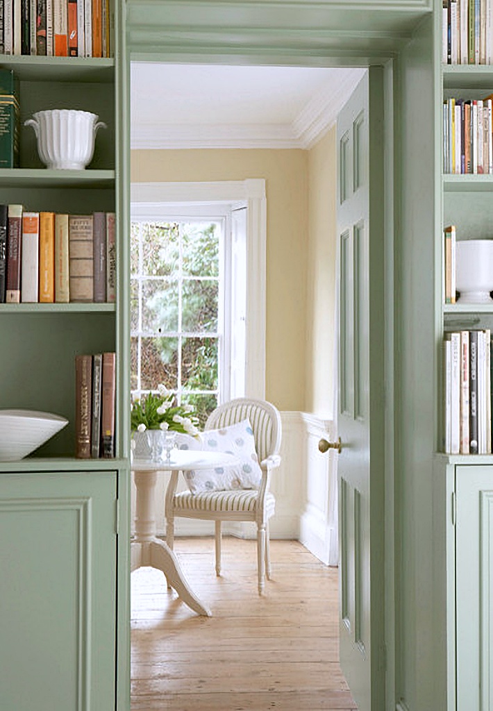
Pea green brightens the shelves and trim adjacent to a tan and white dining room. When I need color inspiration like today’s spring palette collection, I turn to fabrics or paintings. I make note of what colors are paired together and use that to guide my choices.
 By The Little Greene Paint Company Manchester
This old English bathroom could be described as having neutral tones but I didn’t want to leave it out of today’s inspiration. Note how the use of a pink floral arrangement adds color to the space without having to make a permanent commitment to a color. Other options include using patterned towels, rugs with color, and so on.
 By The Little Greene Paint Company Manchester
Today’s post started with a door, so we’ll end with a door – and this one’s a beauty. Wearing Dorchester Pink, this front entry features detailed pillars and an arched transom window. So pretty!
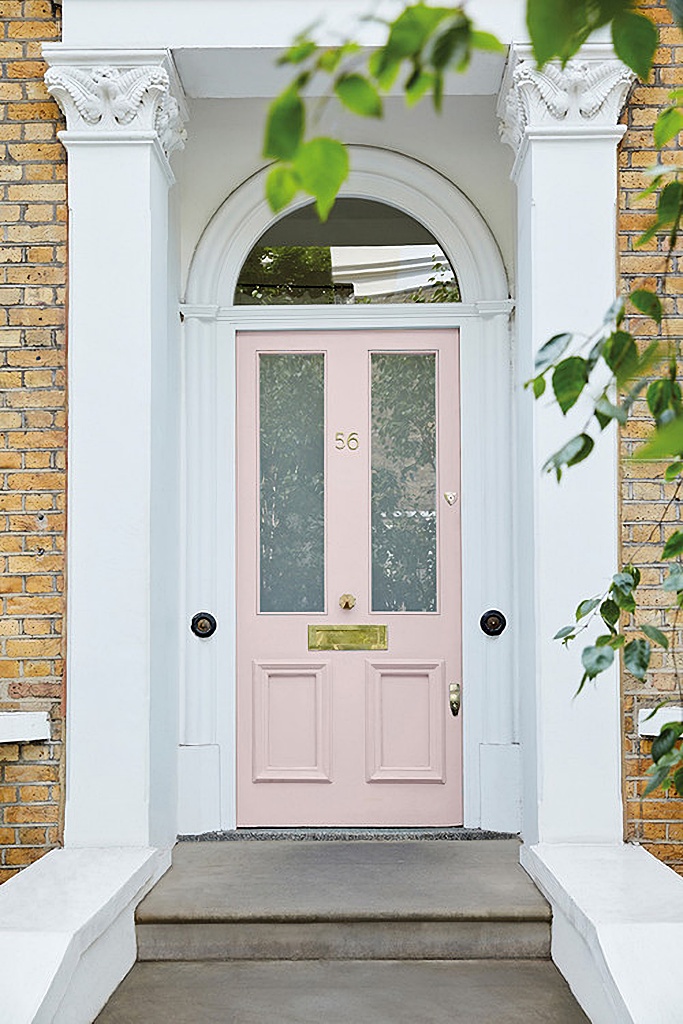 Photo by The Little Greene Paint Company
Hopefully today’s spring palette by The Little Green Paint Company helps you see how to incorporate soft colors into your home, blending them beautifully with neutral tones.

Good Morning Jennifer, Without exception, I love all the soft colors, and all the soft, pretty, endearing decorating ideas too. @->~–
That pink door is so fresh. I love this spring palette of color. Cute wallpaper color in the shelves too.
Love all these examples for using color in your home.
Nice post, thank you Jennifer. I particularly like the first front door and window.
Oh this makes me want Spring to arrive now….its so cold outside! Wonderful post Jennifer!