Dining Room Color: Because One Thing Leads to Another
Here we go again! A couple weeks ago we painted the family room a dark gray color, which of course led to a need for a new dining room color. Isn’t that the way it goes at home? One change in one room leads to another change in another room.
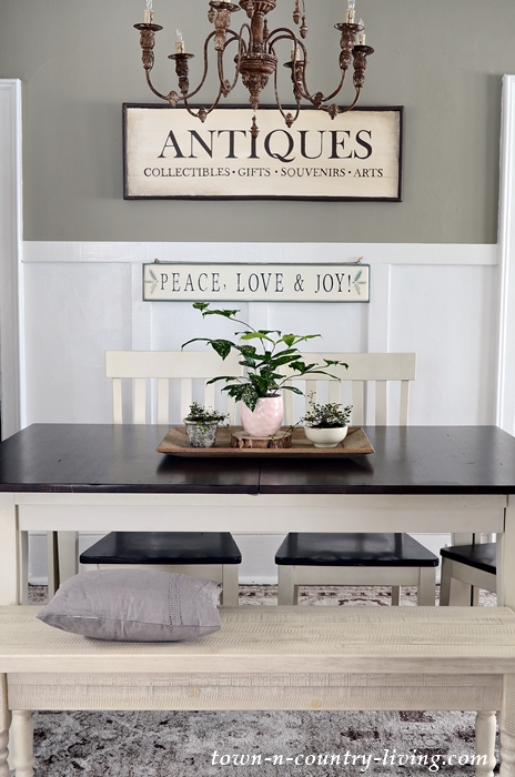
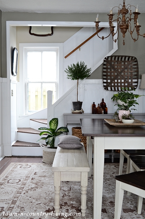
Say hello to Benjamin Moore’s earthy Downtown color that now graces our dining room walls! And yes, the door went from Ultra White to Wrought Iron (another Benjamin Moore color).

The upper walls previously wore White Dove, also by Benjamin Moore. Although I love this creamy white color, I felt like the room needed more definition. Especially after adding the board and batten.
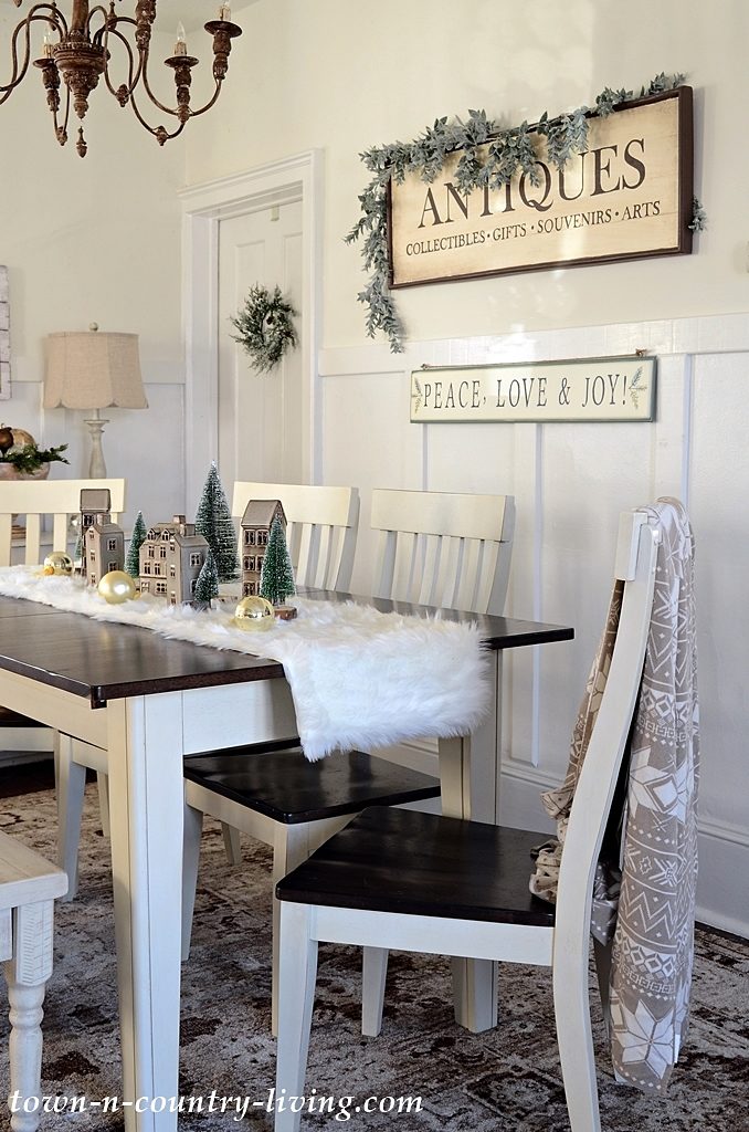
The dining room color gives more dimension to this space and adds a bit of much-needed drama.
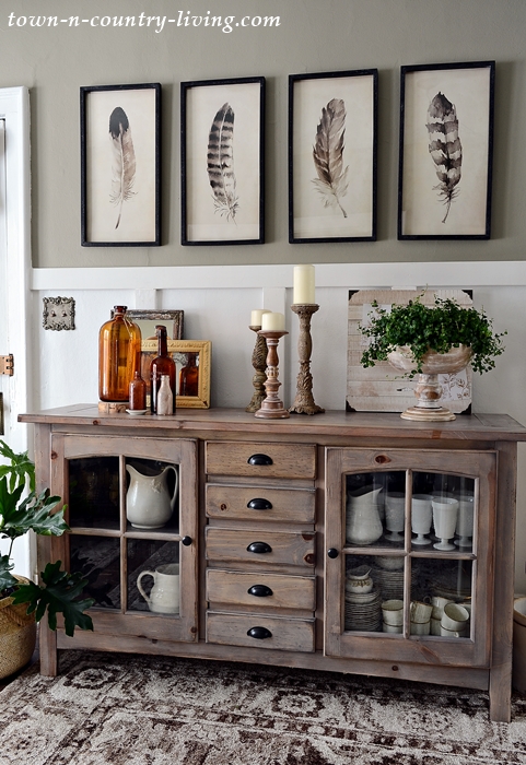
The feather prints above the buffet look prettier (in my opinion, anyway) on the new dining room color. So why did I choose Downtown as the new color for my walls?
You might remember that I selected Mole’s Breath for our family room just a few weeks ago. Although the color is by Farrow and Ball, the Benjamin Moore paint store (which no longer carries F&B) were able to match it.
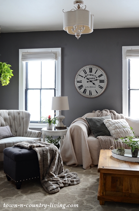
Farrow and Ball has a color called Mouse’s Back which I thought would be perfect in the dining room since it’s adjacent to the family room. I like when your eye flows from one room to the next and color can make this happen.
Mole’s Breath. Mouse’s Back. Two animals, two complementing colors. Makes sense to me! Rather than have the color matched by the store experts, I chose the Benjamin Moore equivalent to Mouse’s Back which is Downtown. And yes, I’m one of those weird people who lets the name of a paint color influence her decision.

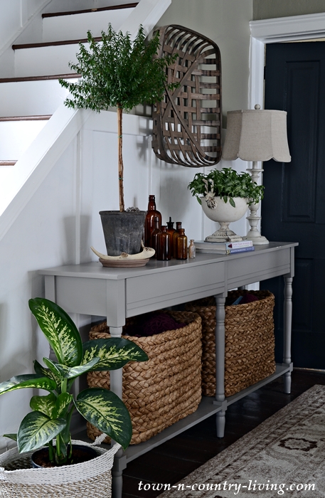
The entryway is part of our dining room so this area also wears Downtown on the upper walls, with Ultra White on the bottom section.
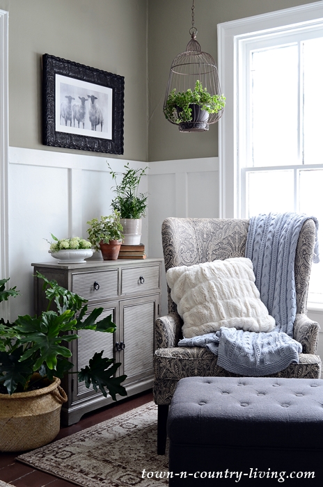
Downtown is in the gray category of paint colors, but it has green undertones which is exactly what I wanted for the dining room. Once I made the decision to change the dining room color, I also chose to paint the sideboard Charleston Gray (BM). It used to be white and kind of got lost next to the white wall.
A year ago I thought I’d paint every room off-white. But after the switch to the dark gray Mole’s Breath in the family room, that all changed! My goal now is to create a welcoming, earthy vibe throughout our home.
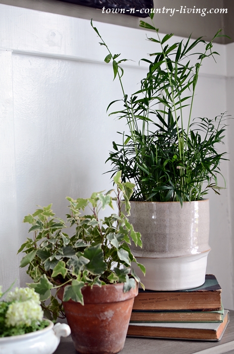
You might’ve noticed a few new plants in the dining room too. I’ll share more about that in an upcoming post because yes, it’s a thing (aka fetish).

Loving the new colors Jennifer. Also, the rug in the dining room is awesome!
The names Moles Breath and Mouse Back made me laugh this morning. I think it kinda of tells the whole feeling of 2020! Happier 2021 to all.
I love the darker color. I think dining rooms feel ever cozier with darker colors and you chose a beautiful one!
Shelley
Very pretty! And rather elegant actually.
I love that you have that wonderful window at the stairs bringing in such glorious light. How clever to use mirrors there also. Where, oh where, do you get your energy!!?? 👏👏
Jennifer I love it and I think the board and batten shows itself more. The chandelier is more noticeable to me. I spied a topiary is it real? I heard they are difficult so I never bought a real one.
Everything looks great
Cindy
Looks great!
I love the warmer more earthy colors in a home too – they’re such a nice change from all the white and off white. Beautiful rooms Jennifer!
That color is PERFECT in your dining room!!!! It really makes the board/batten pop, and your furniture stand out. Love, love, love!!! My master suite is Benjamin Moore’s Revere Pewter, which is similar but perhaps a tad lighter, and I adore it – it’s a similar ‘grey’ but with warm undertones, so it works with so many colors. Great job, beautiful!!!
I love your new colors and the plants!
I love paint and how it can change a room although I hate painting and would rather clean a public bathroom with a toothbrush. Your choice is fantastic! I’ve pinned it for my own home inspiration. Everything is beautiful!
WOW… Just gorgeous!!!!
Ooh, I am in love with your new colors! Everything is just gorgeous and so welcoming.
Looks beautiful! I love the colors you chose. Give me all the contrast.
Tis gorgeous what you have done.
Blessings,
d
Excellent choice
The new color is terrific! I’m loving the darker colors that are showing up in home decor recently. Your home is prettier than ever now!
Love the new colors – both living and dining rooms. I just spotted the picture in the living room with the three sheep. Very sweet. Is that an original piece of art or a print readily accessible? Now I want the warm colors, too. Perhaps when we get moved.
Love the greys you have chosen! Adds a nice depth to your home. The feather pictures are stunning on that color!
What a difference. Makes all decor “POP”. Love your chosen colors.
Love love love your new colors. I’ve never been a fan of all white walls, although I love white trim next to earthy colored walls. My own great room and foyer is gray, with rooms off of those two areas in dark-ish jewel tones – one blue with gray undertones, one green with gray undertones, one brown with gray undertones and a guest bath in purple with gray undertones – all earthy and comfortable and calming. Isn’t it great to have a home where you can make it your own? So blessed.
what a great color. your dining space looks so pretty.
Love the new colors! Your accessories and furniture show off more!
I love the new paint colors! Very rich and welcoming! Also, your plants are beautiful and very healthy looking!
Oh Jennifer, the colors are gorgeous! You have made a real transformation of your home this last year and it looks great. I am envious of your ambition and your results. Now, let’s discuss those color names. Who Does that!,Moles are on the axis of evil and as my granddaughter says, the only mice I like are ones that wear clothes and can talk. I mean, really, I can’t even bring myself to say the names. Maybe I’m exaggerating, but maybe not.
Your home always looks great. I love it both ways but the new colors are enticing and cozy. I’m inspired.
Love the color choices – exudes a much warmer vibe. Please, please, please consider relocating your tobacco basket. The entire piece needs to be on the same color portion of the wall. Spanning the two colors just makes it look out of place. It’s a great accent piece and deserves a placement that shows it off to its best advantage.
Love the color choices. Looks great. I even like the baskets where they are! Where did you find them?
Love,love love your style.
May I please have a link to where you purchased your rug? It’s the color I’m looking for and I thunk it looks distressed which I dearly love. Thank you for your reply!
Hi Barbara! I found the rug on Wayfair. It comes in a lot of sizes. You’ll find it here: https://rstyle.me/+1WcHtc6dZMxDZDjFuaXkCg. I really like the rug – it’s soft and a little plush but not too much.
Love your new colors! Reading your thought process was fun too!
Thanks Pat. It seems like the home is always a work in progress – but the journey is part of the fun!
I love your new colors that you chose for your house, they really emphasize all your other decor beautifully.
Thank you, Marlene. I don’t know why color selection can be so agonizing sometimes. I feel like I’m finally getting it right after all these years. LOL.
Your new colors are such a nice contrast with the white trim and board and batten. I love lighter colors in my home but have a darker color above chair rail in my dining room. It’s Benjamin Moore Scenic Drive, a lovely medium tone green! Below the chair rail is Navajo White. I think that room can carry darker colors. I’ve had it about seven years and still love it. I am also influenced by the names of colors I am considering! (I chuckled at Nancy’s comment above about your color names!) It just adds an extra dimension to the new color, I think!!
Great post!
Hi Christine! Your dining room sounds lovely. I always thought it’d be fun to have a job naming paint colors. I wonder what the qualifications for that position are? 🙂
I love the Buffett!!! May I ask where you purchased?