Discover the Most Charming and Wonderful English Kitchen
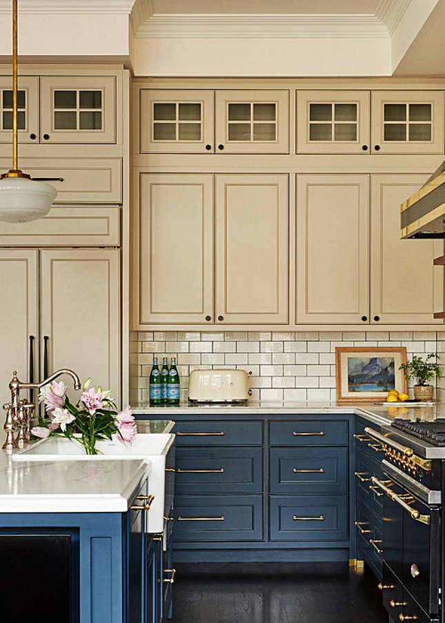
Although green cabinets are trending in the kitchen these days, I keep finding pretty blue kitchens, like today’s super charming and cozy English kitchen by LDa Architecture & Interiors that includes a corner breakfast nook. This is 100% my kind of kitchen. Not too big, not too small, and aesthetically appealing.
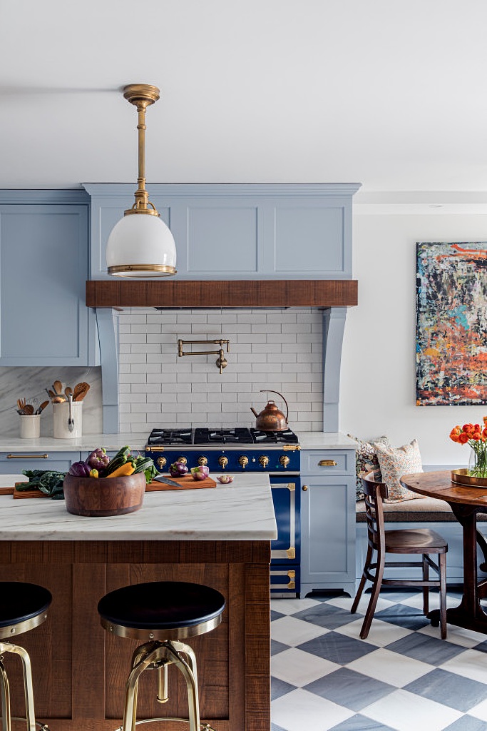 Photo by LDa Architecture & Interiors
A more panoramic view allows you to see how the checkerboard floor works so great in this space. It’s a grayer shade of blue than the cabinets and adds character.
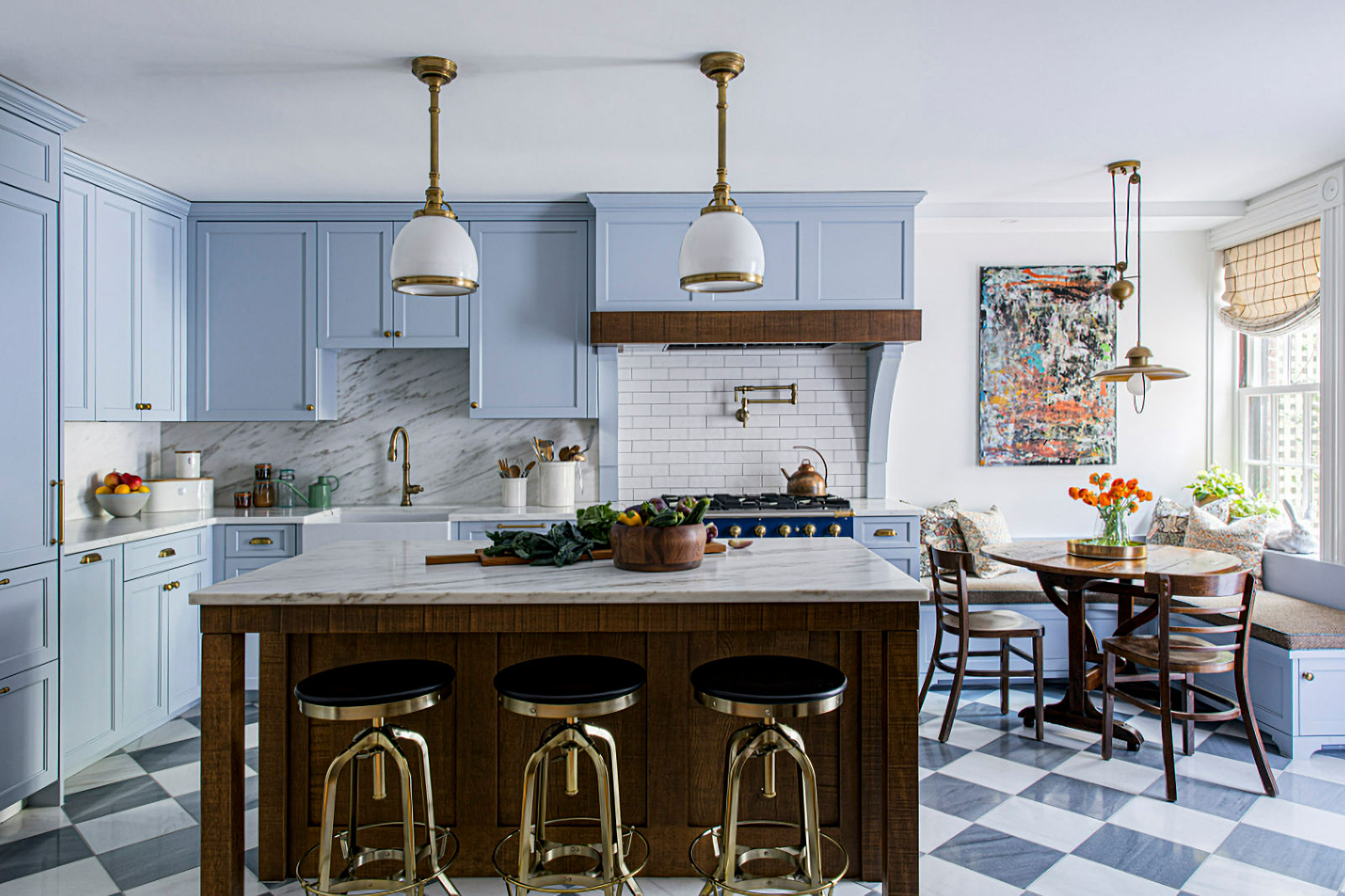 Photo by LDa Architecture & Interiors
The corner breakfast nook enjoys a colorful, contemporary painting paired with a wooden table and chairs snuggled up to a built-in banquette. A unique light fixture adds interest, along with the windowpane checked shade tucked into a window with Victorian bullseye trim.
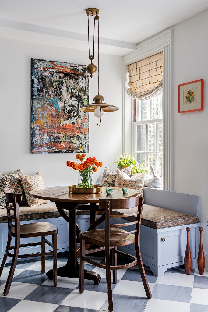 Photo by LDa Architecture & Interiors
Look closely and you’ll see a ceramic rabbit resting on the windowsill behind a pair of pretty pillows. The end of the banquette reveals a door that opens up to storage. This angle of the breakfast nook reveals the texture of the table top.
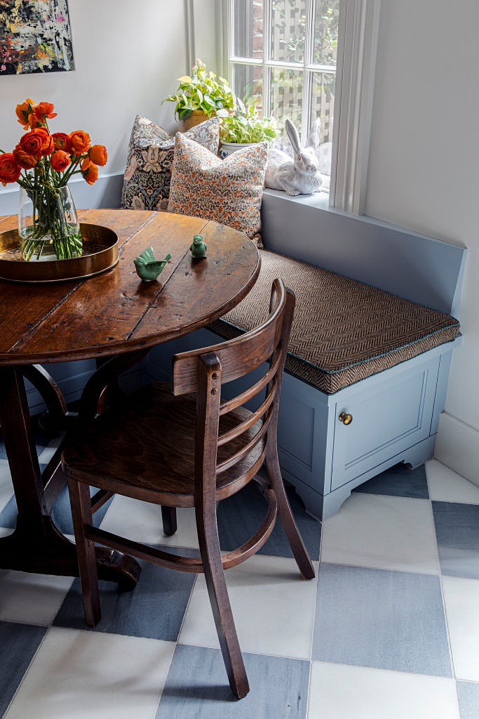 Photo by LDa Architecture & Interiors
The blue English kitchen leads out to a private courtyard for ease in al fresco dining. A gorgeous wood hutch is revealed in the corner opposite the breakfast table.
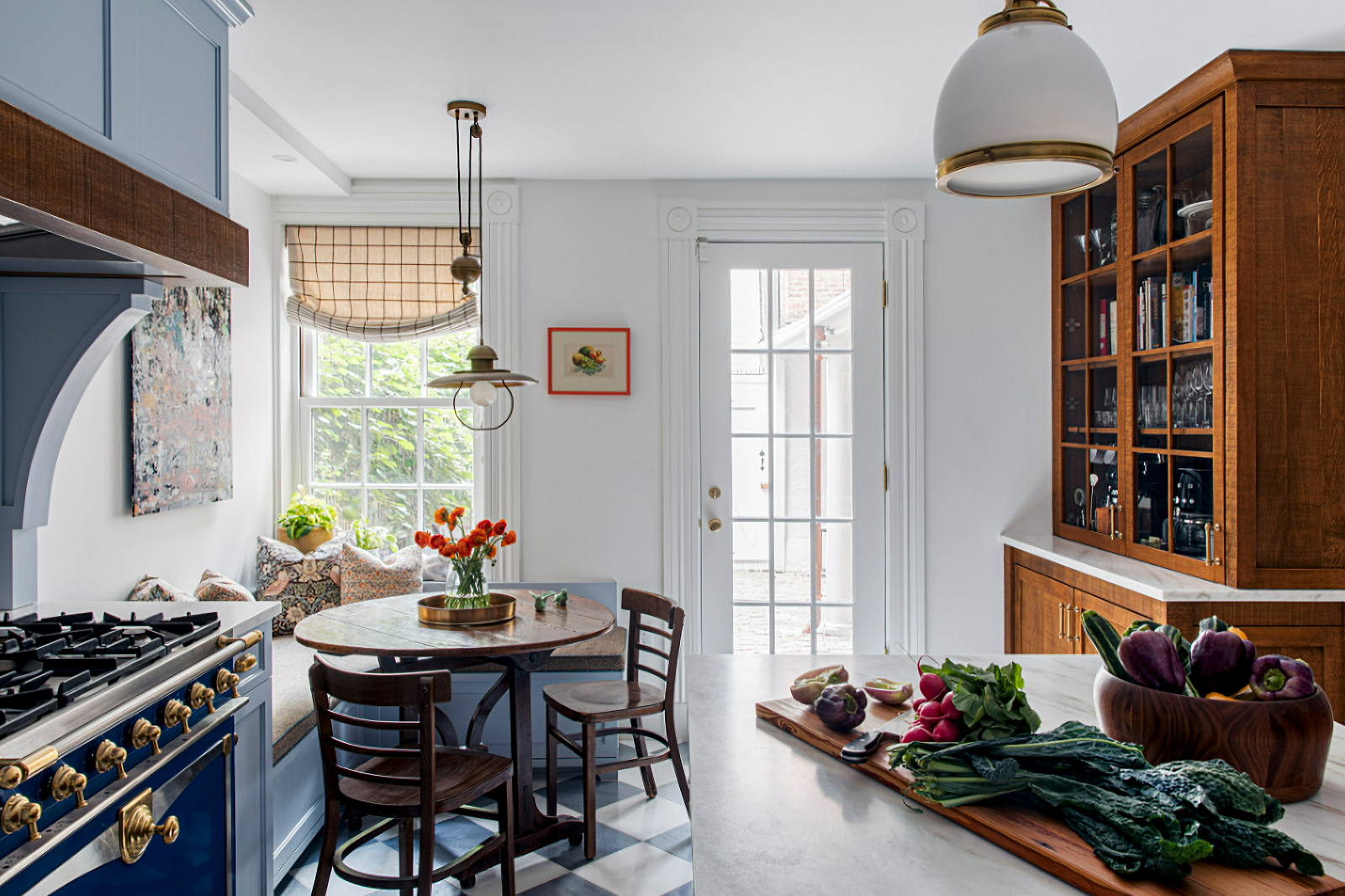 Photo by LDa Architecture & Interiors
A marbled backsplash complements the pale blue cabinets and checkered floor. It’s such a restful color and the perfect hue for starting your day with a morning cup of coffee.
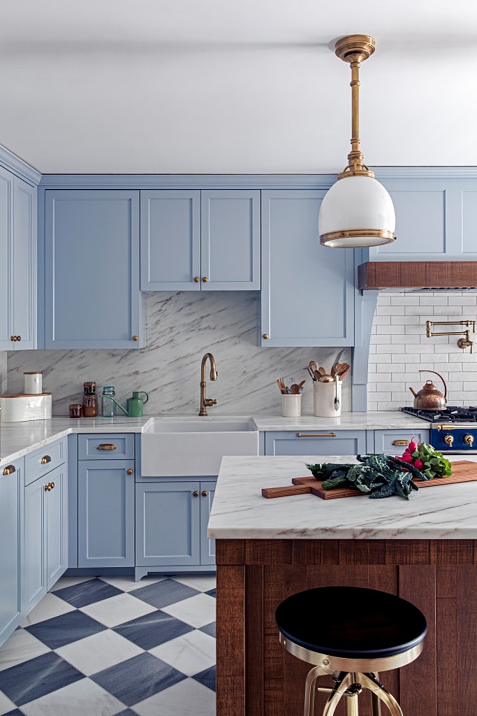 Photo by LDa Architecture & Interiors
A fun pop of yellow is used through the Kitchen Aid mixer that’s left out on the counter as an accent piece. Brushed gold hardware lends a touch of elegance to the cabinetry.
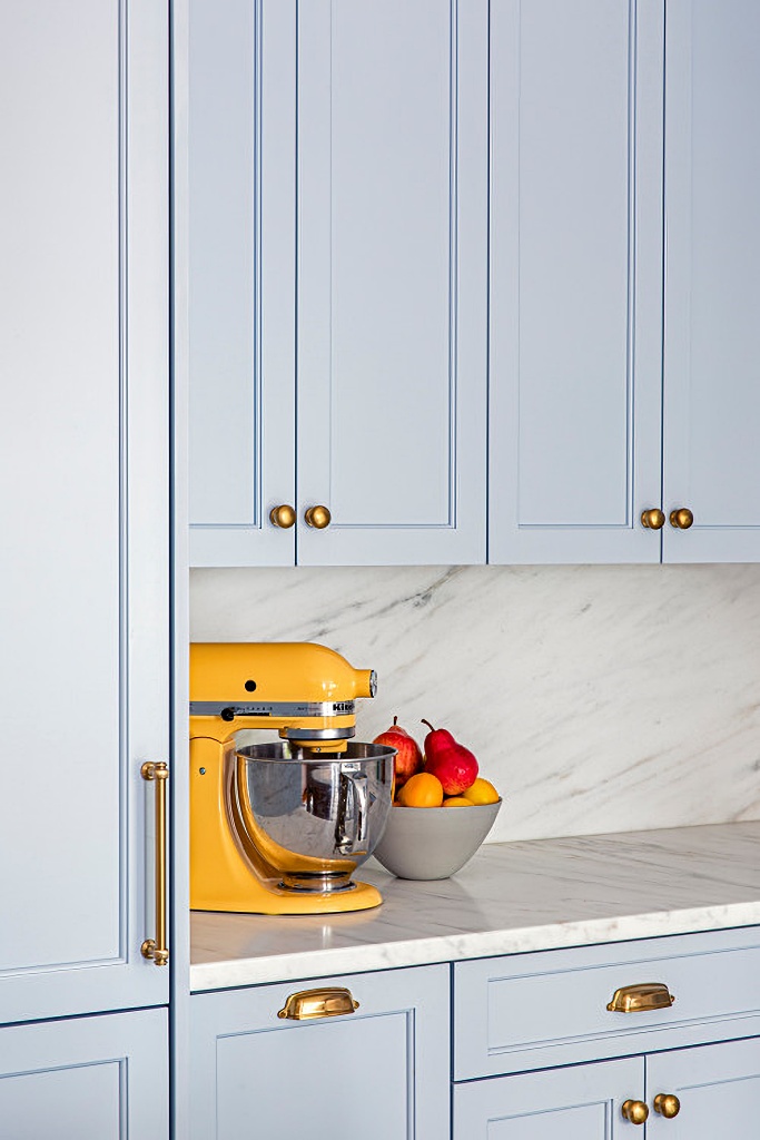 Photo by LDa Architecture & Interiors
I recently painted my own kitchen cabinets a slightly darker shade of blue and a currently adding more colorful accents, as opposed to all the white pieces I have. I never thought I’d go back to a blue kitchen (my first kitchen was country blue) but I’m glad I did.
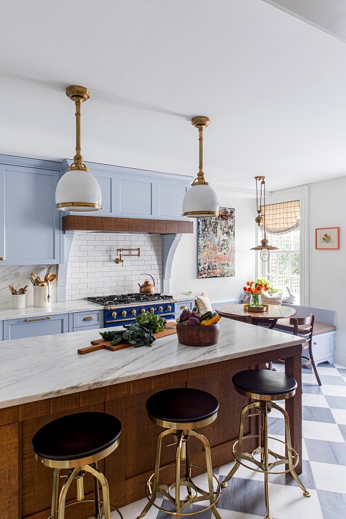 Photo by LDa Architecture & Interiors
See more of today’s charming English kitchen by LDa Architecture & Interiors.
As promised, today is the day I promised to announce the winner of The Romantic Home book giveaway. Congratulations to Deb G!! Deb, check your email for details!

I am totally in agreement about the size and aesthetic of this kitchen…except for the floors. I’m just not a big fan of checkerboard floors. But the rest…Especially the marble backsplash! Ooh la la! Oops, it’s an English theme not French! And by the way, your kitchen cabinets are such a beautiful shade of blue. Can you share the color? Thanks for your wonderful and inspiring posts!
This is a warm and inviting kitchen. I like the look of white kitchens, but they never feel warm and inviting and do not encourage me to linger. I also like the little table and chairs. My present kitchen does not have a breakfast area and I sorely miss it.
It is so nice to see people going back to color. I am heartily tired of bland white farmhouse style and have returned to lots of color in my home decorating and it has made a world of difference. I like warm and cozy interiors with interesting objects.
Beautiful! Love that shade of blue on the cabinets. That hutch is gorgeous!
Lovely kitchen, those blue cabinets are the perfect blue color and I love that light over the breakfast area.
That is just the perfect blue for that kitchen and the pendant light is so good.
I totally agree that this is about the perfect size kitchen. Like just about everything in this kitchen. The color, the style, the layout. Only one little thing I would change if it was mine. That painting would have to be replaced with something else. But that’s just a matter of preference. It’s a wonderful kitchen.