My 140-year-old dining room is screaming for a re-do. Well, maybe not screaming … but it could use a little help. I’m happy with the colors; Martha Stewart’s Quaking Aspen green walls paired with white trim, but the table and chairs could use some freshening up. The windows could use some dressing, too. Right now they’re graced with a simple, white, roman shade. So I’ve been perusing some photos for inspiration …
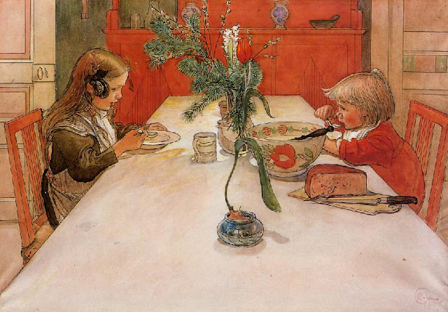
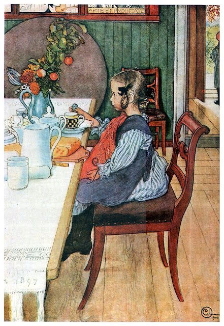
This print of Carl Larsson’s painting hangs in my kitchen. His artwork led to my love of Swedish interiors, such a great use of color, and yet, many soft hues in Swedish design, too.
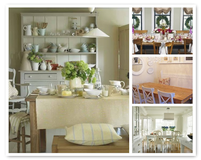
This dining room reflects the softer shades found in Gustavian Swedish design, originated by Swedish King Gustav III who created his own version of the French Louis XVI style.
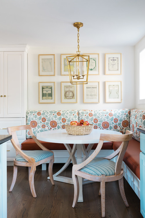
A blue and white theme is classic and beautiful, and this blue-gray shade is just yummy.
More soft blue and white. The Swedish influence is obvious.
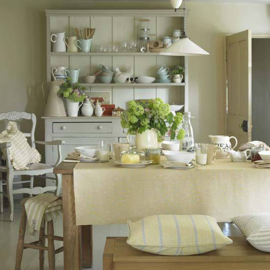
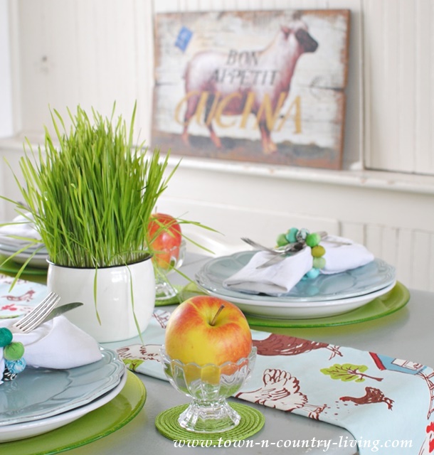
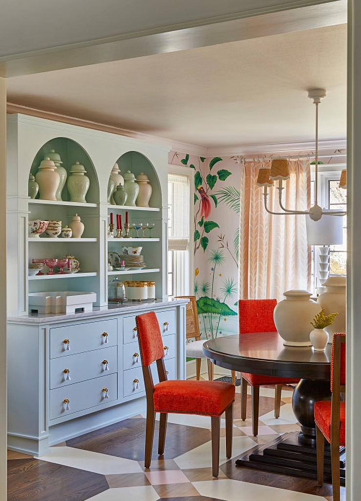
This room is to dine for! I love the soft, french country colors. It’s just dreamy.
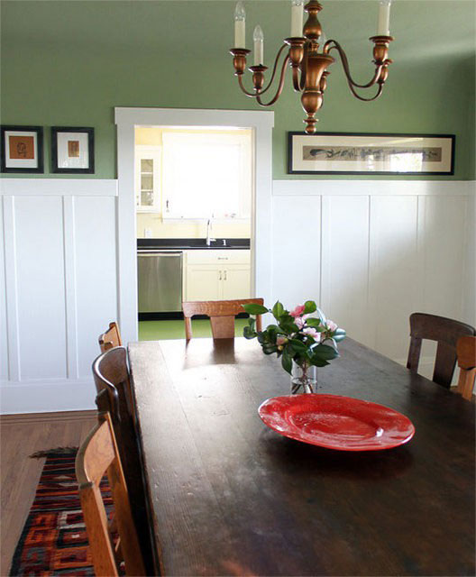
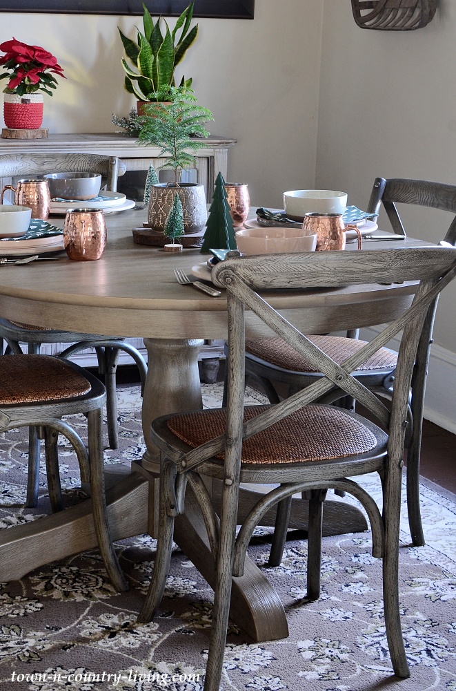
Love the trimwork in this dining area. The green is a tad darker than the color on my dining walls. The table is such a rich wood, but I’m not too crazy about the chandelier.
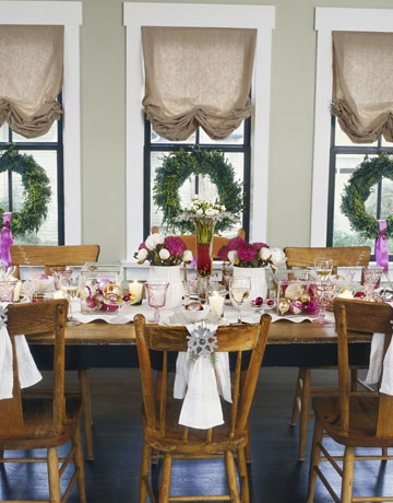
Love this dining space! More soft colors (seems I’m leaning toward the softer side). I love the pops of color on the table, and hello … the black trim on the windows is fabulous. I truly think I’m going to try that on my own windows. The shades are so organic. At first glance I thought they were burlap, but now I’m thinking they look more like linen. A wonderful Christmas setting!
And here’s the other Carl Larsson print I have in my home. I always wondered why the little girl looked so sad until I found that the title of this painting is “A Late Riser’s Miserable Breakfast.” Larsson loved to paint his family … his daughter must’ve been in trouble that day.
I was hoping to re-do the dining room before Thanksgiving but that’s just not gonna happen. Maybe by Christmas I’ll be able to post photos of the room’s transformation. Thanks for stopping by!
Linking to …




Such pretty dining rooms. I love the Swedish use of light colours, too. Have fun choosing all the details.
Beautiful rooms … I love the second one and actually have it pinned on Pinterest!!! Have a beautiful week!
Oh, I love your inspiration rooms! The Swedish style is so light and airy, but down to earth at the same time. Thanks for sharing at MM. 🙂
Anything blue and white finds it’s way into my inspiration folder. Loving the Swedish room particularly.
Thanks so much,
Mary @ SeaQuilts
I love that painting! You found some great pictures to inspire you.
Welcome to blogland!
Londen
Good luck with the redo I’m sure it will come up looking great! There is always so much inspiration to be found online isn’t there makes me wonder what we did before blogland 🙂
The art work and those dining spaces are beautiful. Visiting from WOW. We are the Equestrian Hallway entry. Stop by for a visit.
I, too, love all these dining rooms! I’ll be anxious to see what you settle on (it won’t be easy, will it?) For now, happy Thanksgiving in your current room. I’m going to follow you!
I love all of those dining rooms you showed and can’t wait to see what you end up doing with your dining room. I am a new follower. Thanks for visiting my blog.
Beautiful art work! Love the rooms.Will be neat to see what you do.
Hi, Jennifer. Thank you for following me!!!, and for your kind comments regarding my table. (I’m responding via a comment b/c I can’t find a an email link.) I didn’t use my gold flatware for a long time, but since we bloggers are pack rats :), I didn’t get rid of it, so now here I am using it again every once in a while! How interesting/smart that when I go to your profile page your web page is your professional LinkedIn page. I think I’ll do that too, since I have a professional life too, in addition to my blogger life.
I look forward to staying in touch.
Those are all so beautiful, I love the Swedish influence in decor. Good luck with your redo.
Such gorgeous pictures. I love the direction of your design style, and I can’t wait to see how it all turns out!
Patti
I was so happy when I saw the Carl Larsson pictures:-)
Elna
All are beautiful and inspiring photos. My fav pick would be the Swedish style.
They are all beautiful calming rooms. I have more color now but find myself leaning towards the neutral with color as an accent. Thanks for sharing the inspiration photos.
You prints are very nice and warm. Thanks for joining my party this week.
xoxo Bunny Jean
Wednesday’s Bunny Hop Party!
Hi,
I love your paintings! The dinging pics are wonderful also. I painted my island and fan hood that color of blue last year and I love it! One thing my home doesn’t have is white. I love white and so want to add some. We moved in to this home two years ago. The walls were cream with tan woodwork. So want to change it to white. The home looked bran new so I thought I had best be patient and wait a while. Best of luck with your dining room. Now a new follower.
These are all beautiful dining rooms Jennifer! I really like the softer colors too ~ so pretty!
Wonderful inspiration. Hope you get your dream room. thanks for joining Wow.
Hi Jennifer
So many beautiful pictures. Wish you à lovely weekend
Agneta
I would love to have those Larsson prints! The children are so charming.
Visiting from the Bunny Hop, Debra
Gorgeous inspirations!! Thanks for sharing at Feathered Nest Friday! The party is up early this week on Wednesday evening because of the Holiday- hope to see you there!
Lots of lovely photos Here!!
Daisy~