Fall Color I’m Crushing On: Shades of Deep Red
Fall color trends typically include a palette of rich jewel tones and this year isn’t much different. One color I’m particularly crushing on is a beautiful shade of red that’s a balance of warm and cool tones. This hue is very similar to Viva Magenta, Pantone’s 2023 Color of the Year. It’s a change from oranges, yellows, and browns and I find it so pretty.
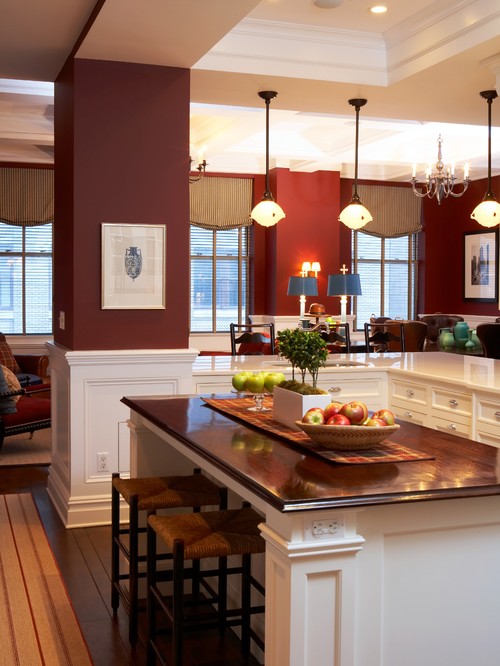
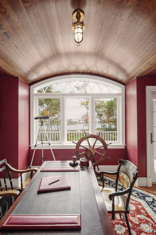 Photo by Home Again by Hancock Lumber
Even in the kitchen it looks warm and rich.
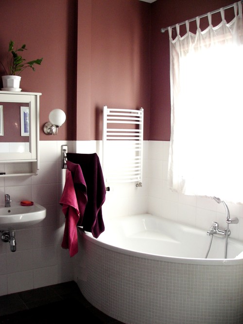
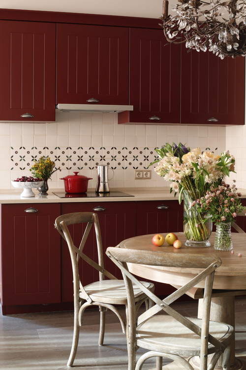 Photo by Студия Олеси Шляхтиной
Whether it leans more toward a berry red, or a purple red, burgundy is a flexible color and you might be surprised over what colors you can pair it with
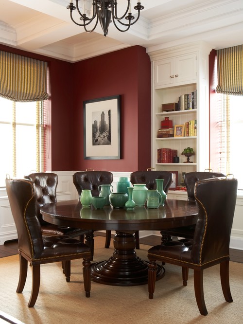
 Photo by Ben Carpenter Photography
Burgundy looks good with natural wood too.
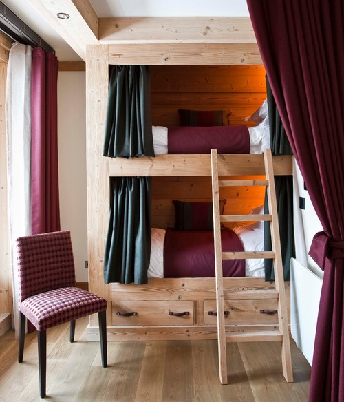 Photo by Nicola O’Mara Interior Design
This collection of photos shows that cool and warm reds look great in every room.
Even the bathroom looks beautiful in warm red and white.
I wouldn’t think to pair jade green with it but when you think about it, burgundy and magenta flowers have green leaves.
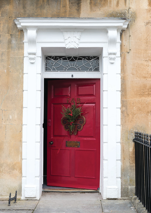
The berry-rich color looks fabulous on a front door!
Combined with purple it looks a bit royal on sunroom windows.
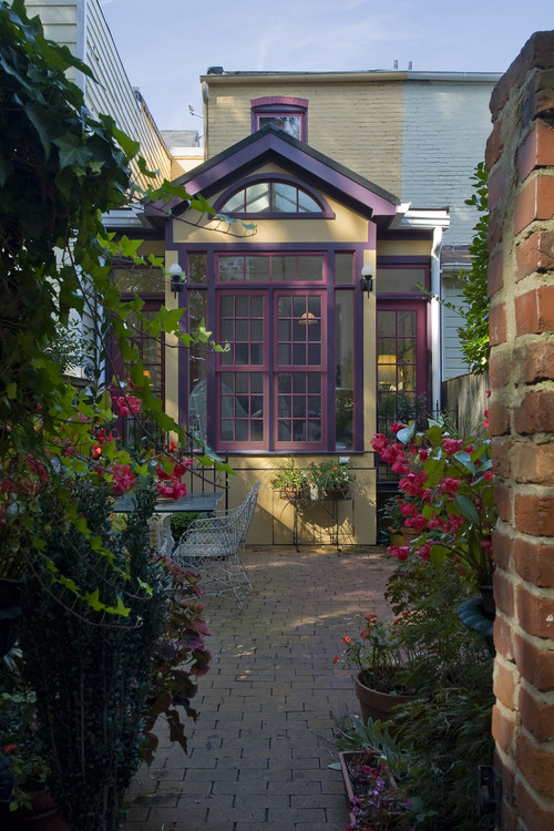 Photo by Christine Kelly / Crafted Architecture
Used in the entryway, it makes a great first impression.
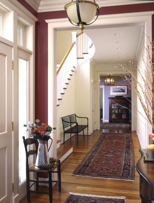 Photo by Melville Thomas Architects, Inc.
This back porch is gorgeous! It reminds me of something you’d see in the Berkshires.
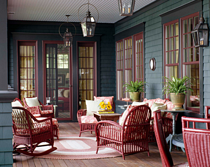 Photo by Janine Dowling Design Inc.
Do you decorate based on a color scheme? What’s your favorite for fall?


These are lovely and i love them, hope you don’t mind if i pick these colors too, of course no one will see them but family and friends. Thanks Jennifer for these ideas.
I’m afraid that red painted walls are too much for me. I’ve noticed in photos of actual homes for sale on real estate listings, that red painted walls, especially in a kitchen, do not take kindly to anything other than perfect decor and lighting – no disarray, no clutter, no normal living that we all experience. The photos that you posted are amazing, but we all know they are styled for photos.
With that said, I love those luscious jewel-toned wine red colors in accessories and accent pieces in fall and winter, and usually warm up the small room where I sit at my computer with dark red throws and pillows.
I’m looking forward to the upcoming posts featuring your fall decor. You have such amazing, down to earth taste.
I like this color and that little brick patio is really my style.
That kitchen island with a wood top? That’s awesome! Love that kitchen. You would think gold accessories would be used more with the deep red, pear red color shade but most used chrome. Interesting. I wonder what kind of wreath is on that beautiful red door…ya can’t make it out but whatever it is it’s so pretty.
That outdoor patio seating area is such a warm space and so inviting to sit and read in. Those colors would make for a great library especially on a cold winters day.
Hard to use reds without thinking Christmas at times but all of these work very well.
It is so refreshing to see color and wood tones making a return into the decor of rooms. As lovely as the creams and white palette is, I don’t find it as warm as color and wood. It was always something I admired in photos, but could never have had in my surroundings. Thank you for sharing these gorgeous rooms.
Here’s to a beautiful Fall everyone!
These are all beautiful rooms. I love red and burgundy shades and use those colors but not as paint on the walls.