Pantone Greenery: 2017 Color of the Year
Have you heard the news? Greenery is Pantone’s 2017 Color of the Year! I love this choice because it’s so organic and earthy. The color green comes in so many shades from kelly to sage to yellow and blue tones. Pantone Greenery is a bright yellow-green that portrays spring and summer in all their loveliness. If you’re ready to add this fresh color to your decor, you’re sure to find inspiring examples here. (Some images are from Houzz – click on photo to be taken to original source.)
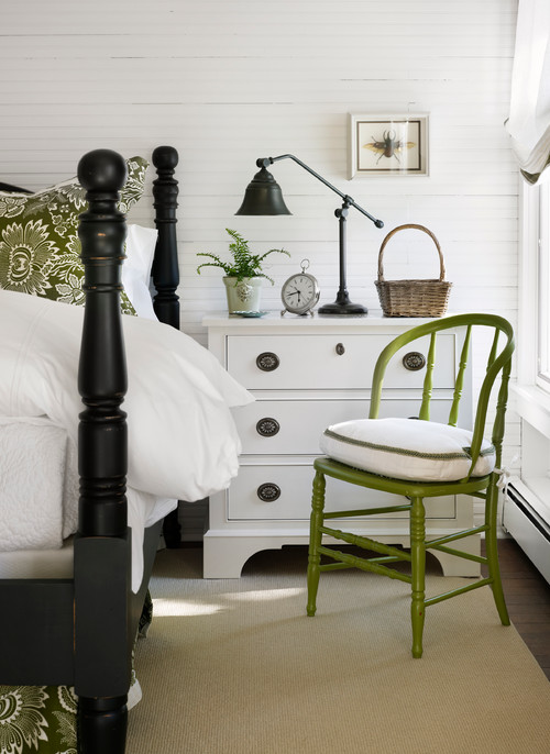
The pairing of green and white is a classic farmhouse color combination. Consider painting a chair in this spring-fresh color.
Photo by Tom Stringer Design Partners
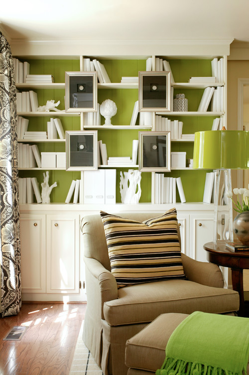
Pantone Greenery makes a wonderful accent color at the back of a book case. A green lampshade and comfy throw continue the color into the rest of this living room.
Photo by Tobi Fairley Interior Design
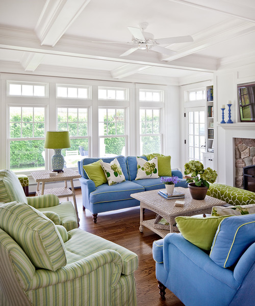
If you fear you might tire of Pantone Greenery in a room, add the trend-setting color in the form of pillows that are easy to swap out.
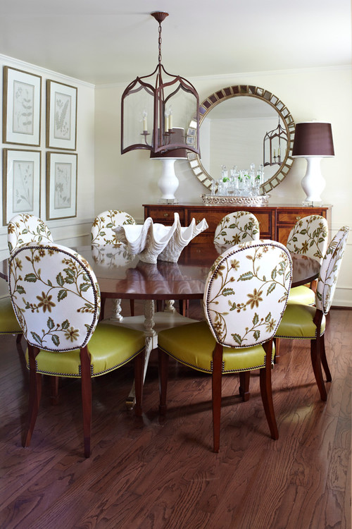
Dining chairs wear a touch of yellow-green in a neutral-toned room.
Photo by Tobi Fairley Interior Design
Are you a little more daring when it comes to decorating? Paint half a wall with Pantone Greenery.
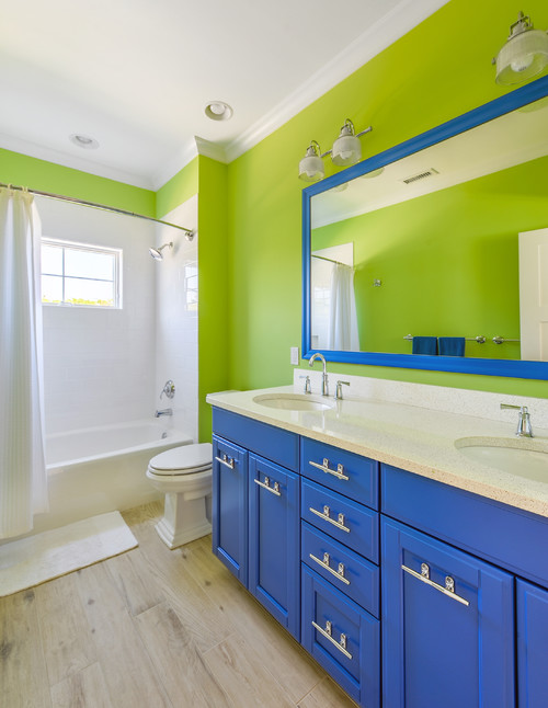
If you love exploring with bright colors, paint the entire wall! I remember seeing a designer on HGTV paint a bathroom a pretty shade of apple green. I tried it in my own bathroom but couldn’t live with it. I’m just not that brave. Here, electric blue balances the green while white adds the right amount of crispness to keep the room from becoming overpowering.
A softer shade of the same yellow-green might wear better with your preference for calm spaces.
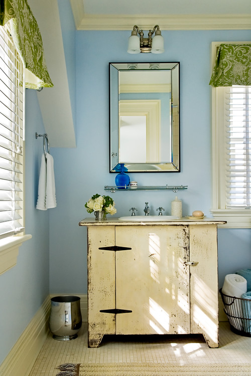
A cool blue bathroom gets a shot of greenery in the form of valances above the windows.
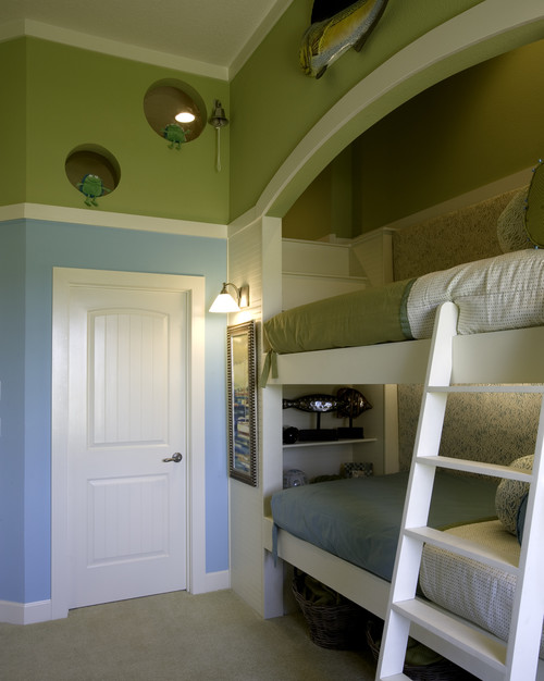
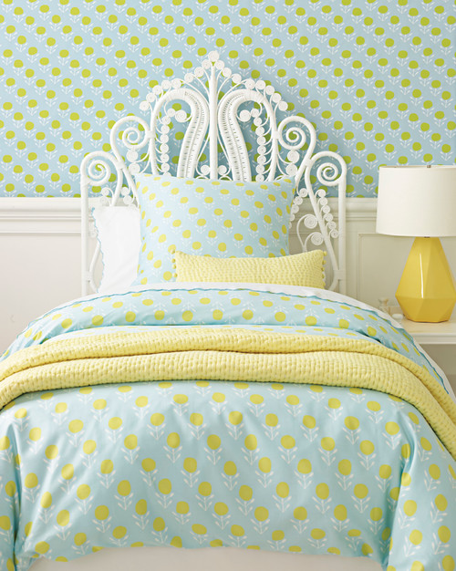
A fun patterned wallpaper and bedding elements lend dots of greenery in a cottage-style bedroom.
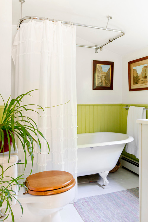
Perhaps the best way to add Pantone Greenery to any room is with … well, fresh greens!
Shop for Pantone Greenery
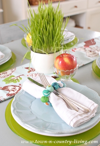
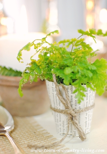
Normally I don’t decorate with a lot of green although I enjoy the color. I looked back through some of my past projects and found shades of green close to Pantone’s 2017 Color of the Year …



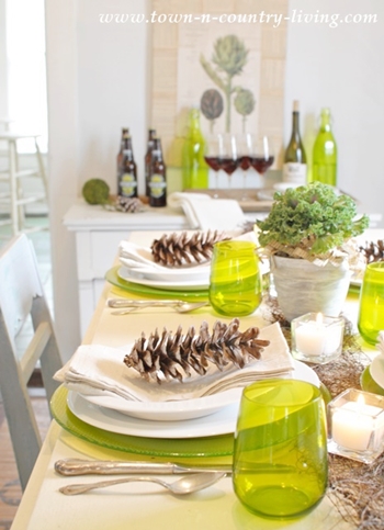
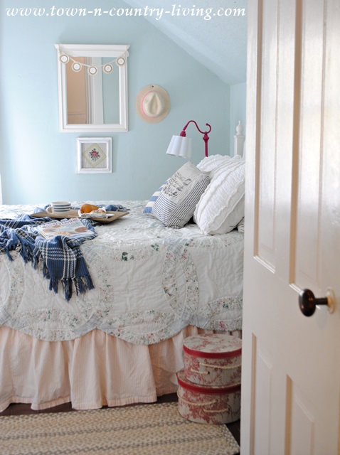
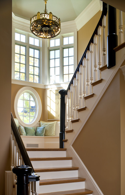
I painted my living room this color about four years ago and was getting tired of it. Now that it is the color for 2017 I guess I will have to keep it for a while. Thanks for the ideas for adding some more earthy touches for spring. After Christmas I will start working on implementing a few!
I’m always anxious to see what color is chosen, but this year’s is not a favorite. I love green, but not the chartreusey yellow green chosen for this year. The inspiration photos show it off just fine but in my small house, it’s not for me. However, while I’m not a fan of using this color inside, I’ll be happy to enjoy it outside in landscape and flower beds once this cold, frigid Indiana winter is over. Wishing you a happy and prosperous 2017.
Well, I wasn’t a fan when I first saw it, but seeing the color used in various ways, I’ve changed my mind. Although I probably will only use it as an accent in the form of plants, at least in my present home.
Love the greenery inspiration….I so love the combination of blues and greens. Use it a lot on my home….Merry Christmas Jennifer!
Pat M. If you want to try it in the garden I have just the one for you. Ladys mantle has beautiful leaves with the tiniest yellow green blooms and will winter over easily. Just clip the flowers before they seed or you will have them coming up all over. The birds will plant them for you too!☺️
So much pottery and greenery, natural green always gives soothing and inspiration.