AKA Design: Charming Home Tour
I’m so excited about today’s tour which features the home of my dear blogging friend Shannon of AKA Design. You might remember that I first featured Shannon’s house back in February of 2015. Well, Shannon has moved since then and I’m amazed at all she’s done with her new place! I think you’ll enjoy her decorating style as much as I do. Ready to take a look around?
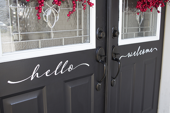
Right as you approach the front door, you can see that Shannon pays careful attention to detail when it comes to home decor. I love the “hello” and “welcome” messages – and the red berry wreaths on the front doors are the perfect color to complement the gray.
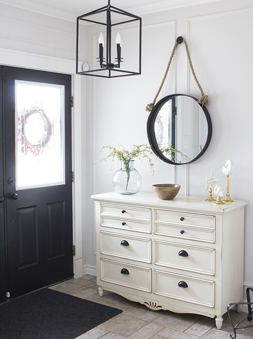
Step inside to Shannon’s beautiful foyer. Note how the hanging portal mirror mimics the circle of the wreaths outside on the front door. The farmhouse chandelier adds a square shape to the space. A farmhouse style dresser is a convenient catchall and of course I love the aqua bottle on top!
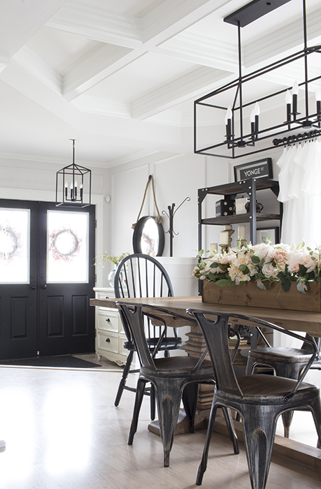
Just beyond Shannon’s entryway is her beautiful dining room. I’m seeing more and more dining rooms just inside the front door of homes these days. It makes me feel better about moving my own dining room to the front living room space. But today isn’t about me – it’s about Shannon’s charming home.
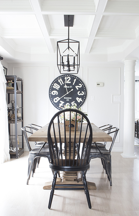
Check out the detail of Shannon’s DIY coffered ceiling. She shares the tutorial on her blog. Classic Windsor chairs flank each end of the farmhouse table. Love!
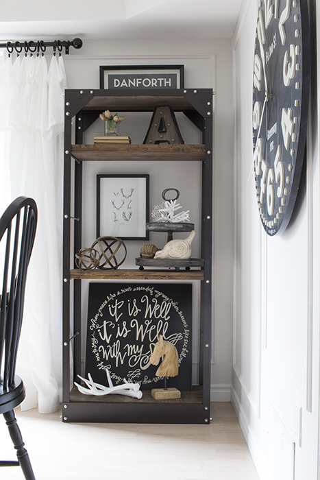
Shannon uses industrial style shelves in her dining room to display favorite collectibles.
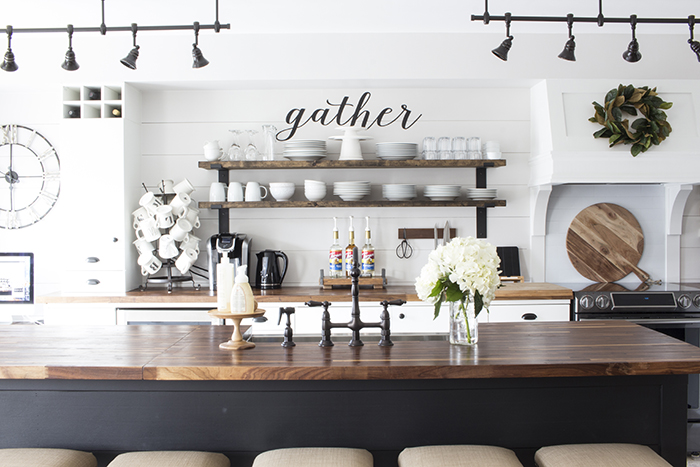
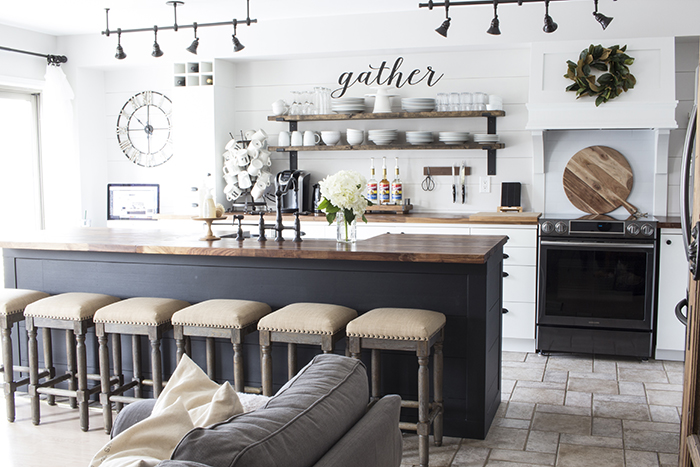
Just beyond the dining room is Shannon’s gorgeous kitchen with open shelves and plenty of farmhouse appeal! From the lights to the “gather” script – I love it all!
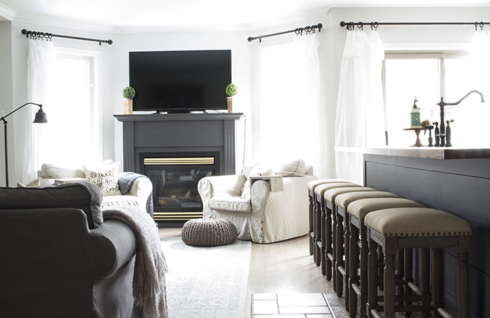
Upholstered stools with nail head trim cozy up to the kitchen island painted gray. I love when an island is a contrasting color to the kitchen cabinets. You can see Shannon’s recent kitchen makeover and reveal on her blog. You have to see the “before” picture. It’s incredible what she’s done.
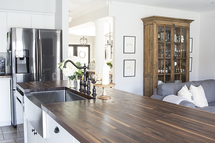
Adjacent to the kitchen with its beautiful wood counter tops (aren’t they gorgeous?) is Shannon’s family room.
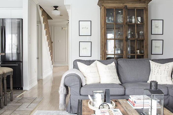
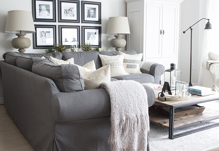
A pretty gray slipcovered sectional is always functional and Shannon added warmth to the space with a wood cabinet.
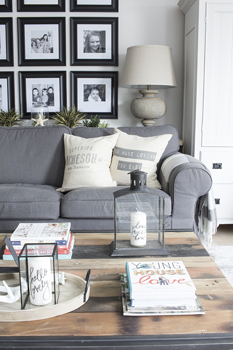
A great way to personalize your home is to display favorite family photos. Shannon created a cohesive image gallery wall by using the same picture frames.
I hope you enjoy Shannon’s new home as much as I do. It’s stylish and comfortable all at once. After seeing it again, I want her to come decorate my place!
Be sure to follow Shannon and her amazing decorating adventures over at AKA Design. She generously shares tutorials and design tips with her blog readers. You won’t be disappointed! Thank you, Shannon, for sharing your charming home with us!
Be sure to see more house tours in my Charming Home Series!


this is beautiful, I love it all!
I actually like the feel and decor of this home more than many of the professionally done homes that you feature on your home tours. Your friend is so fortunate to have such a beautiful and inviting home. And I love the new trend of the dining room being at the front of the house. What could be more welcoming when entering someone’s home than the table where everyone gathers to celebrate family and friends? Plus, when not in use on an everyday basis, there’s much less visible everyday living “mess” at the front door when someone drops by.
I love how she has used her wood pieces for texture and to make things stand out. Thanks Jennifer.All these tours give me ideas for my home.
She’s definitely a decorator after my own heart. Love the use of wood and wood shelving. Some really great home ideas here.
Thanks,
Elizabeth