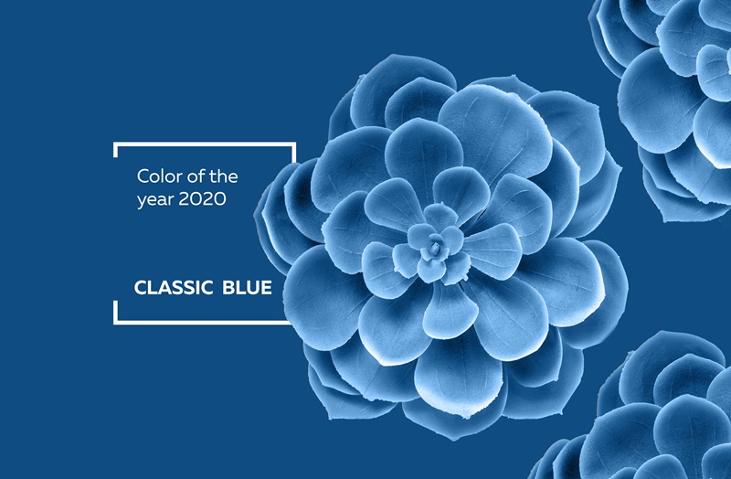
Classic Blue: Announcing the Pantone Color of the Year
At the end of every year I look forward to Pantone announcing its Color of the Year. Classic Blue is the honored color for 2020 and following you’ll find inspirational ways to use it in your home.

Classic Blue is a calming, confident hue that “highlights our desire for a dependable and stable foundation on which to build as we cross the threshold into a new era.”
Do you have a collection of white ironstone or other white dishes? Look how great white looks in a cabinet painted a classic blue. I don’t think any other color can make white tableware pop like this.
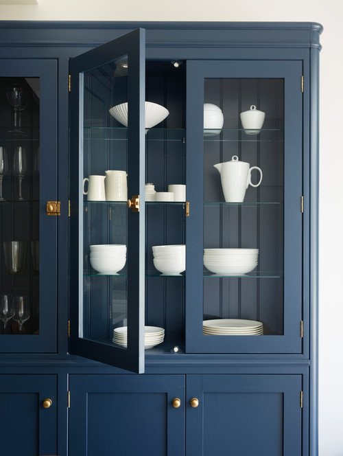 Photo by Davonport
My first kitchen was a classic blue and white cottage style kitchen – but the blue had a touch more green in it. Blue tends to be a popular color for country kitchens. If it’s too much for you, consider painting just the kitchen island.
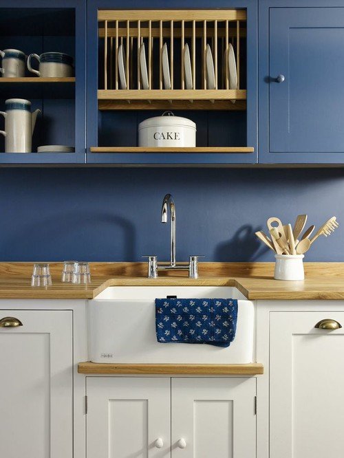 Photo by Coppice Guild
Blue always looks great with yellow and this rich shade of blue really makes the custom cabinetry stand out.
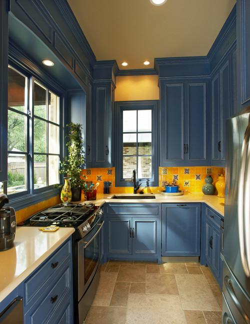 Photo by Michael Lyons Architect
Pantone Classic Blue doesn’t have to be limited to walls and cabinetry. Use it on fabrics like this pretty shade shown in a more contemporary dining room.
 Photo by Case Design/Remodeling, Inc.
A traditional living room enjoys a blue sofa with a blue tiled fireplace. Just beyond the French door on the right, you get a glimpse of a blue room. Probably a den, which looks quite cozy.
 Photo by Andrew Howard Interior Design
Consider adding a coat of classic blue to your front door. If you have a white house and don’t mind painting, it might be fun to switch your front door every year to the Color of the Year (okay, maybe that’s a bit over-enthusiastic).
 Photo by Charmean Neithart Interiors
Even an interior door looks beautiful in blue.
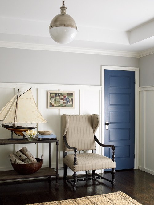 Photo by Joshua Smith Inc
Are you a fan of more feminine rooms? Classic blue looks soft and pretty in an English Country living room.
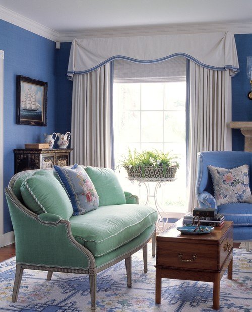 Photo by Anthony Baratta LLC
So what do you think of Pantone’s choice of Classic Blue as the Color of the Year for 2020? Are you a fan?
Enjoy More Colors in the Home:
Blue and Green Color Combos for Decorating
10 Ideas for Decorating with Painted Furniture
Pantone Greenery: 2017 Color of the Year

Blue is one of my favorite colors. Love this!
I love this color! I have it scattered all over my house in accessories, but now I’m thinking of painting a room classic blue. Thanks for your inspiration!
I’m a cool color person so I absolutely love the blue. I have a can of blue paint in my garage, a little darker version of this color, waiting for me to paint my foyer. There is a lot of white doorway trim in my small foyer, so it will balance out the dark color. It’s been on my to-do list, so it being the 2020 color is inspiring me.
Blue is my favorite color and all my gray painted rooms are accessorised with blue. My mother gave my a set of blue and white Churchill china ages ago and that started my blue. You are the one who influenced me to paint a room gray and it looked so good with my blues and wood furniture i painted two more rooms, thank you Jennifer.
I love it I painted the exterior of my house that very same color.
I love the color blue. I have my ensuite and master bedroom in blue, although not quite this dark of blue of this year’s color.
I love this blue! I think I will paint the interior main doors of my mountain home this color! TY for the suggestion! I have all white walls with green doors now. This particular blue will add additional accents!
At last, my favorite color !!!!
Reminds me too much of the dark jewel tones of late 80’s early 90’s. The older I get I need light neutral colors. The darks are too dreary
What brand of paint did you use to paint the china cabinet?