Historic Texas Farmhouse: A Mix of Light and Dark
Today’s beautiful historic Texas farmhouse might look familiar to you. It was lovingly restored by Tim Cuppett Architects of Austin, Texas and appeared in a 2012 issue of Country Living magazine. I have CL magazines that go back that far; I should look through them to see if I can find this home feature. It’s a classic Texas ranch with a spacious porch and a stunning yet quaint interior.
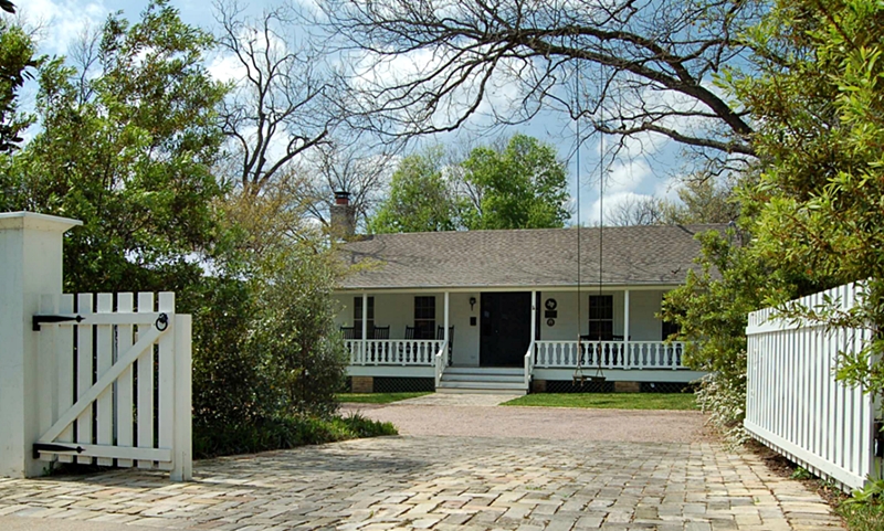 Photo by Tim Cuppett Architects
The expansive porch boasts a collection of painted rocking chairs, perfect for enjoying a lazy summer evening with friends and family. The porch is long enough to include a table at the far end where a game of cards or an intimate dinner can be enjoyed.
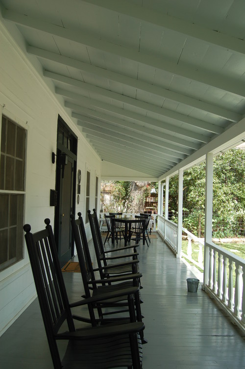 Photo by Tim Cuppett Architects
Pages of fall leaves create simple artwork above the antique hutch residing in the entry way. A pair of vases in slightly different shades of green sprout branches from the yard.
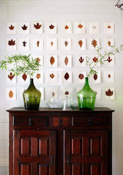 Photo by Tim Cuppett Architects
This photo is the one I remember the most when this Texas farmhouse was featured in Country Living. The owners transformed the entry hall into a dining room. Clever idea!
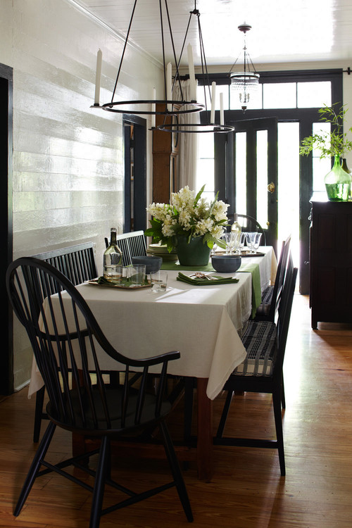 Photo by Tim Cuppett Architects
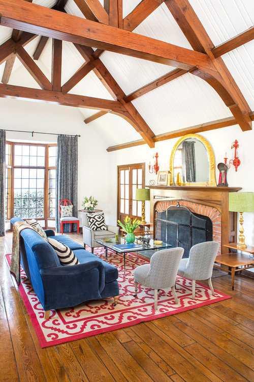
The living room wears dark-painted shiplap walls. A modern chair is paired with a simple sofa and an oriental rug.
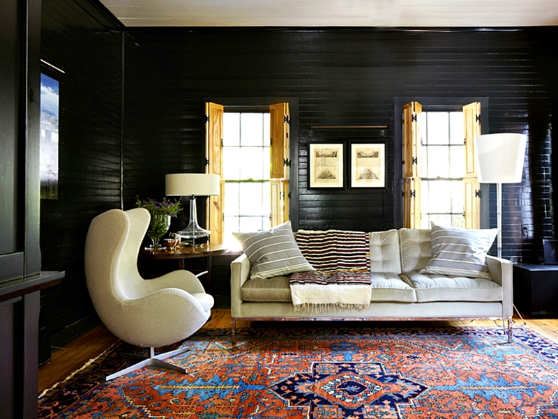 Photo by Tim Cuppett Architects
On the other end of the room is the fireplace with a cozy seating area. What do you think of dark walls like this in the living room?
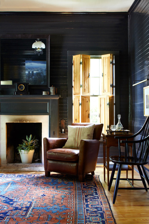 Photo by Tim Cuppett Architects
Rather than modernize the kitchen, this Texas farmhouse keeps its historic appeal with a utilitarian kitchen. A red stove takes center stage on the left while a collection of pots and pans provide artwork on the far wall.
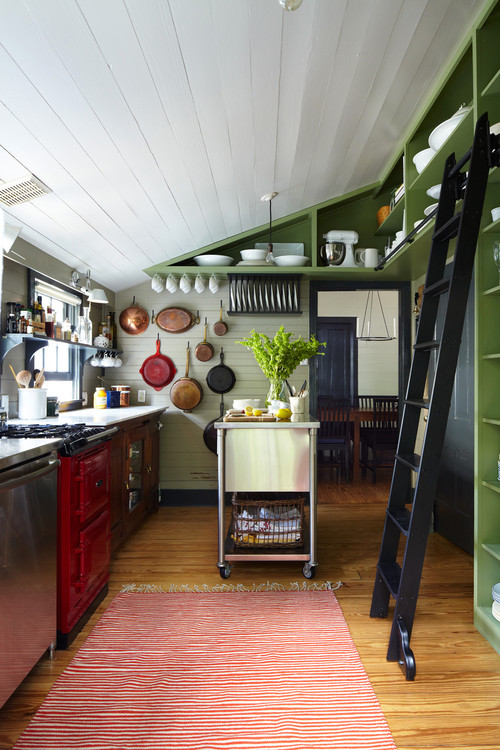 Photo by Tim Cuppett Architects
A rolling ladder makes dishes easily accessible on open shelves in the kitchen. The white dishes look so pretty against their green backdrop and the black door adds a bit of sophistication.
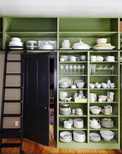 Photo by Tim Cuppett Architects
A rustic desk creates a cozy office space. I love the painted wood ceiling and paneled walls.
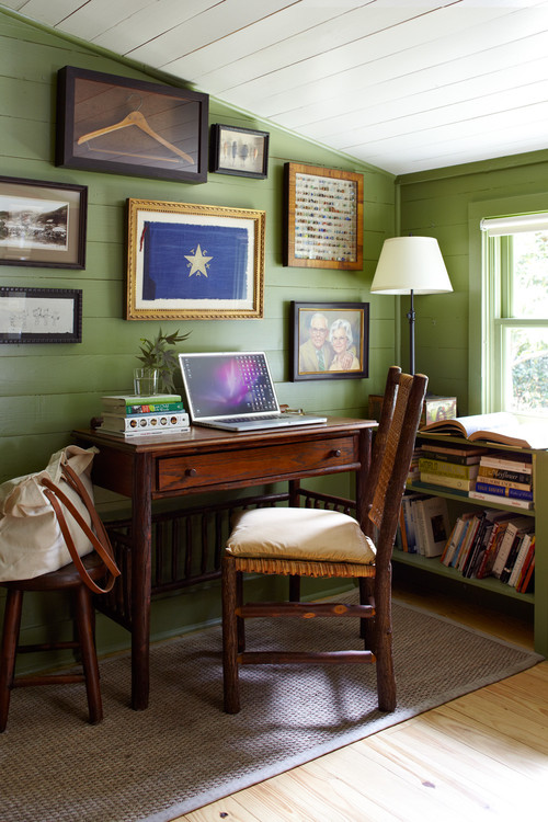 Photo by Tim Cuppett Architects
A beautiful claw foot tub graces the small bathroom with its wall of windows and porthole mirror. Normally I prefer dark wood floors, but I really like the pale wood in this space.
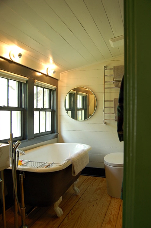 Photo by Tim Cuppett Architects
A blanket chest at the foot of the bed gives the homeowners a place to keep vintage quilts and other bedding. An antique light fixture overhead adds a bit of whimsy to this Texas farmhouse bedroom.
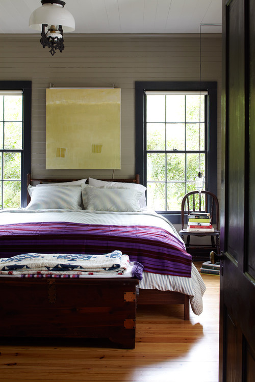 Photo by Tim Cuppett Architects
Another bedroom showcases a Scandinavian style painted daybed that a furry friend has claimed as his own.
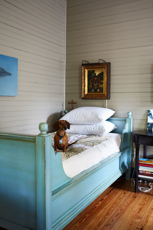 Photo by Tim Cuppett Architects
You’ll find even more charm outside with a small back porch shaded by a large tree.
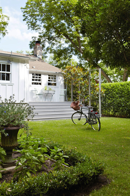 Photo by Tim Cuppett Architects
You can see more photos of this Texas farmhouse by Tim Cuppett Architects


Well, all you have to do is look at the covers of your saved CL magazines. The kitchen of this home is the cover feature. I love the color choice of this kitchen and have, since it arrived on my doorstep, dreamed of painting my original cupboards in my now huge laundry/mudroom, those same colors! Love what they have done!
Wow what an absolutely BEAUTIFUL house! Over here in the UK you just don’t get houses with big front porches like that. A porch is more like a small covered bit to leave your boots in. This house is gorgeous!
Very odd house with a mixture of styles. Part of each room had me going ”oooh yes’ and then ‘oh …nooo’ Overall I very much liked it.
I love the dark walls, something about black furniture or walls that is so striking! The mixture is wonderful Lisa@ Sweet Tea N’ Salty Air
I so remember this beautiful farmhouse!….especially the photo of the foyer and those great leaves!
I have the pic of the hall/dining room ripped out and in my “someday file”!
Nice! LOL, I win…I have magazines back to the 90″s. Might be an illness.
LOL! I am so glad to know I’m not alone in this addiction! Sometimes I’m a little embarrassed to admit it, but I have baskets, bins, and old suitcases devoted to house my collection. I know I could (and I do) just pin them on Pinterest, but there’s something about the tactility of turning pages, that is so satisfying, to me.
his hall/entry could have been a control back in the day -my favkrite.
French doors as front door and front door.
It was.popular before air condition! would
T his hall/entry could have been a dog trot back in the day -my favorite!
French doors as front door and back door.
Breeze turnout the hall.
It was.popular before air condition!