Charming Cottage Style Kitchen Tour with Fun Tile
When it comes to kitchens, I tend to prefer a cottage style kitchen because it feels homey and comforting. I don’t need all the latest and greatest appliances and gadgets – just give me something functional and charming. Today’s kitchen by Paul Lopa Designs has plenty of cozy appeal, along with a fun tile pattern for the back splash.
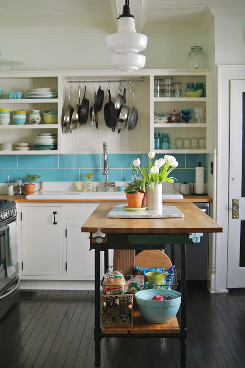
The back splash might be the first thing to catch your eye. I think most people are probably hesitant to add a busy back splash, but I think it works in this cottage style kitchen.
Rather than keep all painted surfaces white, the homeowners opted for a bit of light blue-green color here and there. The light fixtures above the kitchen island are unique and charming.
The counter matches the gray in the decorative tiles, pulling the whole room together.
The cottage-style kitchen has ample space for a fairly large table. A lot of homes have smaller breakfast nooks, but it’s nice to have room to invite guests for a casual dinner.
On a recent shopping trip I spied chairs like these and fell in love with them. Unfortunately – or maybe fortunately because I didn’t spend money – I have no need for new dining chairs. But these sure are cute and fit well with the kitchen’s theme.
The bright and cheery kitchen is both functional and pretty, and the wood floor adds an element of warmth.
What do you think of this cottage style kitchen? Are you a fan of the bolder choice in back splash?

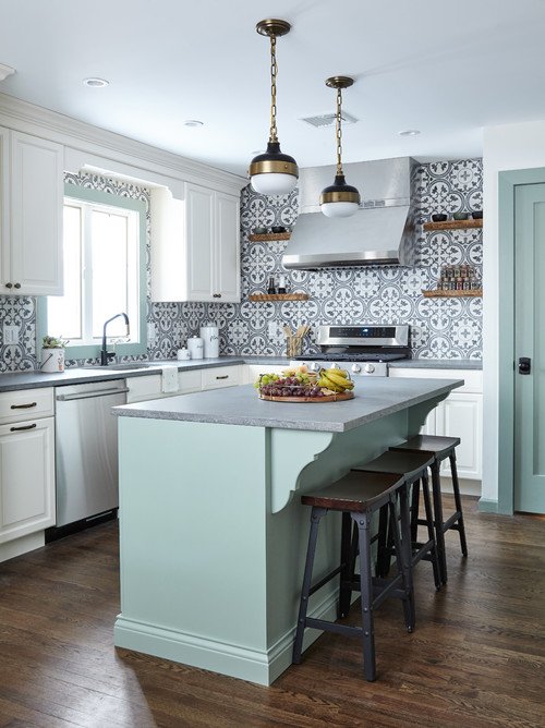 Photo by Paul Lopa Designs
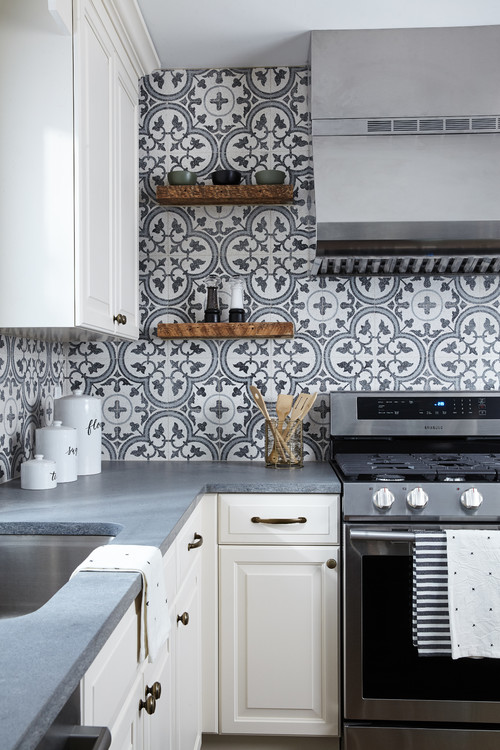 Photo by Paul Lopa Designs
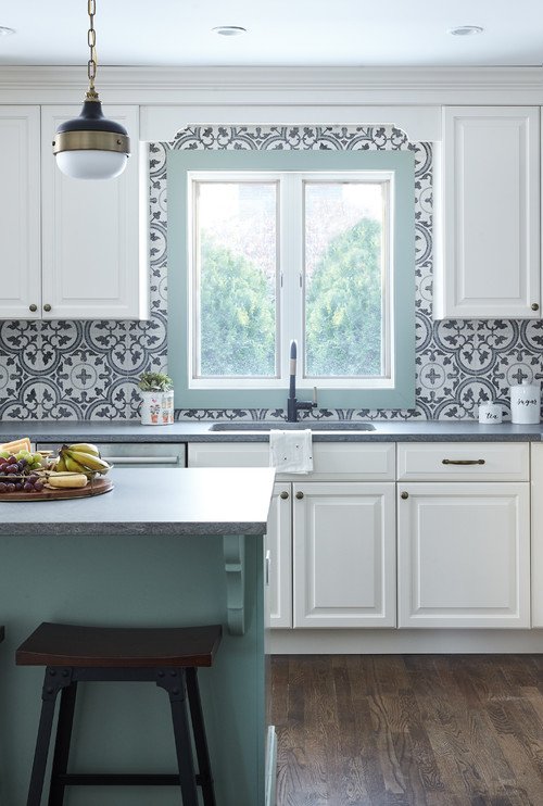 Photo by Paul Lopa Designs
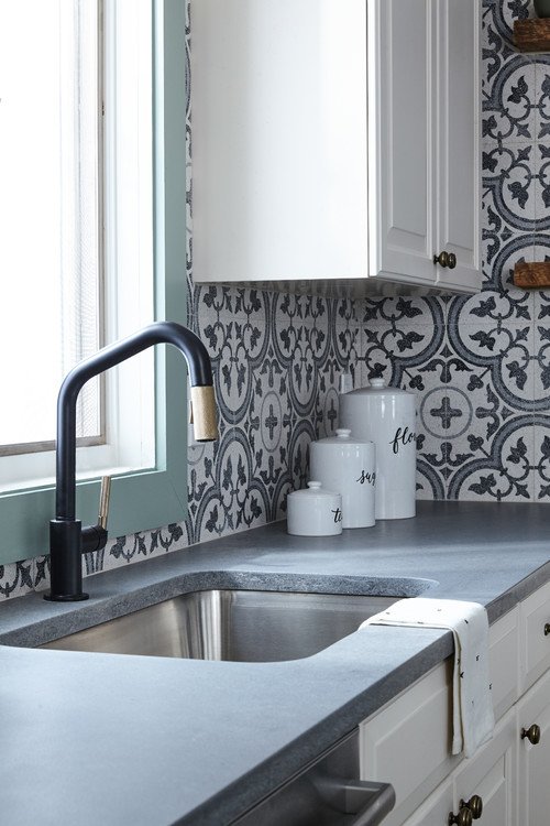 Photo by Paul Lopa Designs
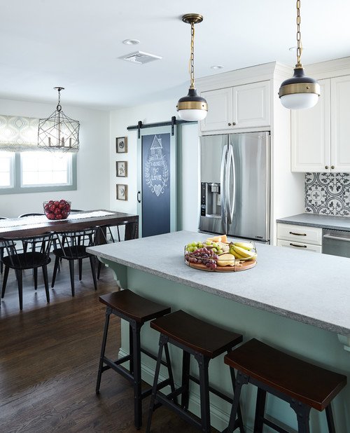 Photo by Paul Lopa Designs
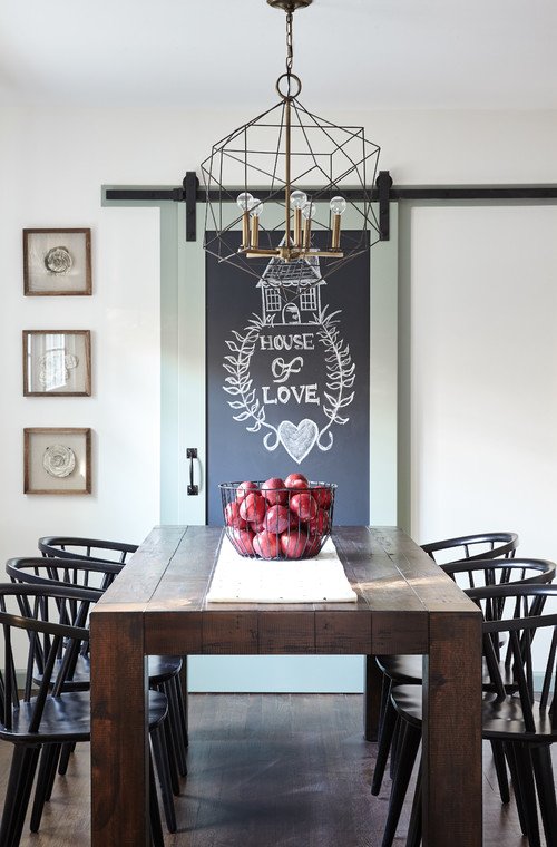 Photo by Paul Lopa Designs
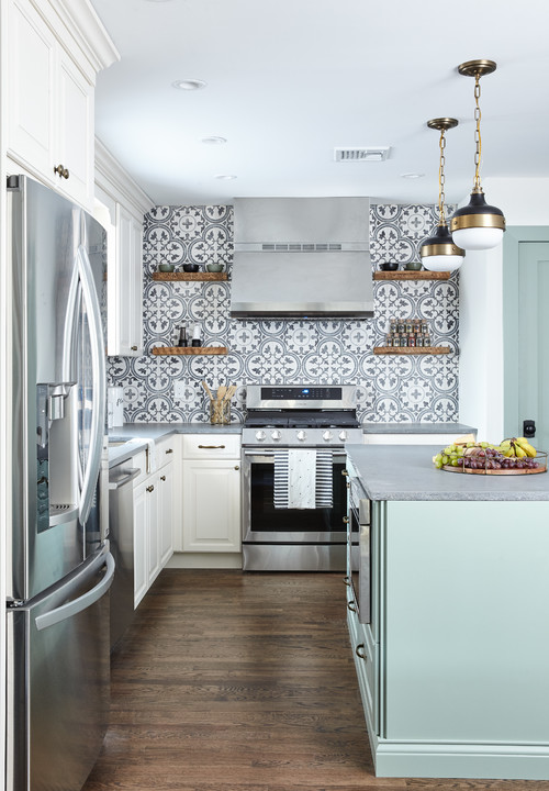 Photo by Paul Lopa Designs


I love the backsplash, and even the painted wood trim, but the painted island was, unfortunately, one step too far for me. I would have liked to have seen it white like the cabinets. Didn’t like the gray counter top with the blueish island paint.
I know what you mean about new dining chairs. I would love to have new but don’t really need them. Mine are sturdy wood and just need a coat of paint and newly upholstered seats.
This is a cute kitchen and would be a bright spot in anyone’s home.
I think the tile is very pretty. But two walls of it makes you a little dizzy. Very nice kitchen. Love the big table at the side, and also places to sit at the island. Lots of room.
I have the same tile pattern in my kitchen- but I stenciled it! And it’s just behind the stove and behind the counter across from the stove. Cost me 25$wish I could figure out how to post a picture
I little too much but, it is not my kitchen and you need to have what you love. It does make this small kitchen seem bigger and i love everything else about it.
I realy love the tile! I think I would have more cabinets instead of the open shelving though.
I find myself saying, “Where’s their “stuff?” when I see a sparse kitchen like this. ha ha
It’s different, I like it! I lean towards red hues rather than blues. I think I would like it better if the light blue was a light coral color instead. It would work with a lot of different colors. Gives me some ideas since I need to update my tan walls/oak cabinet kitchen.
Thanks for sharing!
Christine
New Hampshire
Hello Jennifer, I like this kitchen very much. It feels homey and not all stainless steel and shiny surfaces. I am currently doing up my laundry after our latest flood and have chosen a similar tile for the splash back. I am looking forward to the little pop of colour it will provide.
I love this kitchen! Mint green is one of my favorite colors and it goes so well as an accent here. I really love the stools and the chalkboard barn door, too.
I totally love this kitchen! Wouldn’t change anything about it.
This is a lovely kitchen and the tile is pretty… but it’s so unfortunately so overused now. Every designer on every design show uses tile similar to this in all their bathrooms and kitchens. I loved it when it was the new trend but am now wanting something different. However, that is just my opinion and I’d be thrilled to cook my dinner in a kitchen like this!
Pretty colors in this kitchen, very soothing. The jury seems to be out on the patterned tiles. I really dislike them. Some of the TV shows made them popular and many people jumped on the bandwagon. That trend will pass and seem dated very soon. They make everything cluttered, I prefer to add interest with accessories…but again, everyone should do what makes them happy. The open shelving is nice. The hanging pendant lights are cute. I love wood floors in the kitchen, we have those too.
Too much for me as I’d tire of it quickly. As someone said above, every tv show is doing this style so it’s over kill for me BUT I do think a design touch over the stove framed or not would be a great touch I could live with. Adding some but not a whole wall would be a good thing, although this is a lovely kitchen and add a touch of green to any room and it’s a winner in my book!
Hi, great choice of tiles. I wonder if you had considered Quartz tiles? I noticed they are now being used in kitchens quite frequently. They are both non-porous and stain-resistant. Any thoughts about them? Nice job anyway and thanks for sharing.
Emma,
http://www.picksforhome.com
I love this everything about this kitchen. You wouldn’t happen to know the paint colour of the island and trim would you?
This is the cutest kitchen and just the right size. Thank you.
First impression of tile is a WOW. But, it will become tiering to the eyes after a while and a pain to upgrade.