Light Green Classic Kitchen in New York State
Light green cabinets freshen up a classic kitchen by Bright Ideas by Martinec in the town of Painted Post, New York. Wood flooring, subway tile, and bead board cabinets create timeless appeal in this dreamy kitchen.
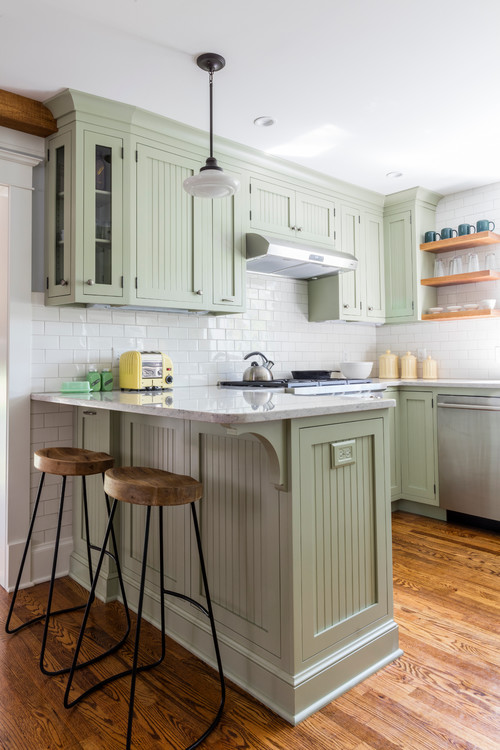 Photo by Bright Ideas by Martinec
The pale shade of green adds color without being overwhelming. Open shelving next to a sunny window above the farmhouse sink creates a feeling of spaciousness. Door-front cabinets would make that area feel more enclosed.
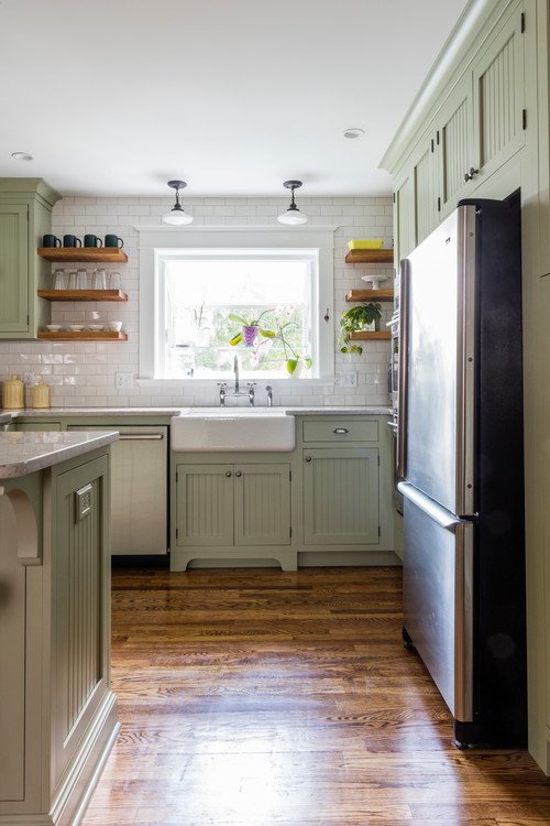 Photo by Bright Ideas by Martinec
One of my favorite plants, a Brazil philodendron, enjoys a bit of sunlight from the window while a pair of orchids get to enjoy the greenhouse style window. My daughter has a window like that over the kitchen sink in her little bungalow house.
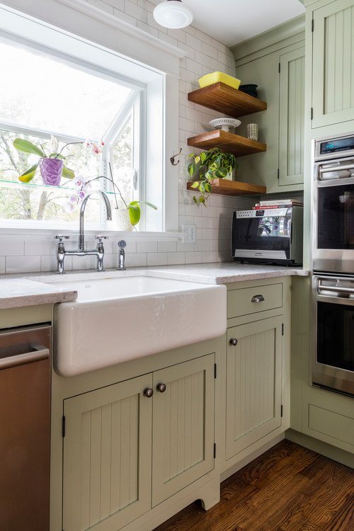 Photo by Bright Ideas by Martinec
The refrigerator sidles up to a double oven with cabinetry all around, making for an efficient work space. The soft green color is soothing to the eyes.
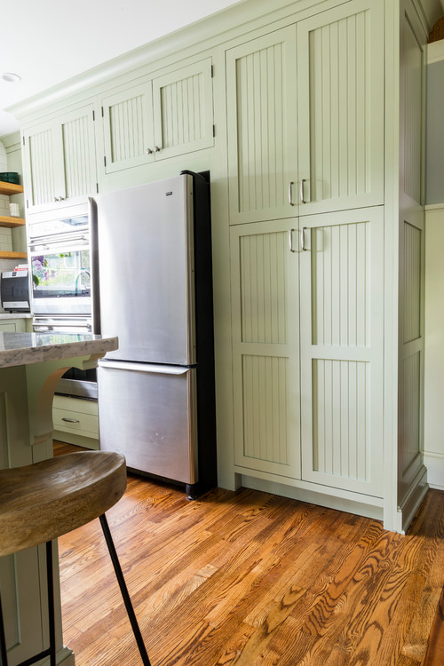 Photo by Bright Ideas by Martinec
The doors to the right of the refrigerator conceal a stackable washer and dryer. Note how the doors open and slide into place on either side of the appliances, eliminating a road block to any traffic flow. Very clever!
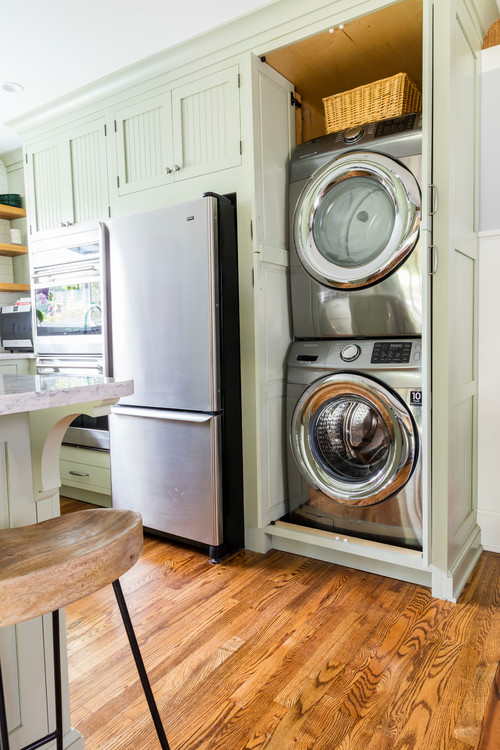 Photo by Bright Ideas by Martinec
Schoolhouse pendant lights add a finishing touch overhead while a retro yellow toaster and jadeite butter dish and salt and pepper shakers lend vintage style at the counter top level. Rich wood floors increase the timeless appeal of this classic kitchen.
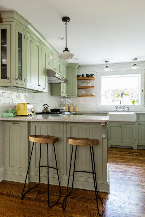 Photo by Bright Ideas by Martinec
And finally, you can see how the kitchen is positioned off the pretty dining room. Lucky is the homeowner who enjoys living in this New York home located in Painted Post.
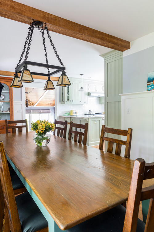 Photo by Bright Ideas by Martinec
You can see more of this classic kitchen and dining room by Bright Ideas by Martinec.
See More Classic Kitchens:
Black Kitchen with Equestrian Touch
Country Inspired Summer Kitchen

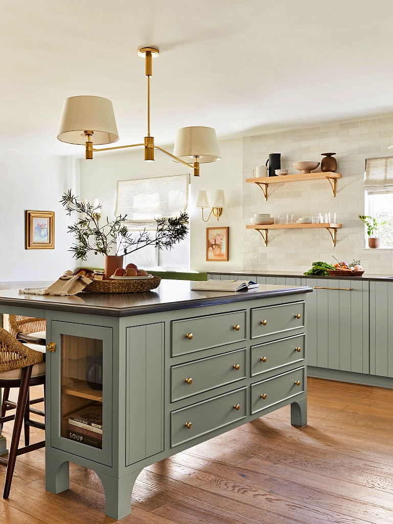
Do you know what paint and color?
Looks like Saybrook Sage by Benjamin Moore….just painted our Master bath cabinetry this beautiful color.
Hi Judy,
Unfortunately, I don’t. I looked at the designer’s info on the project and a paint color wasn’t listed. It’s a beautiful color, though.
It does look like Saybrook Sage since my kitchen has been painted this color since 2004. If you google
Strawberry Cottage Ohio….you will see the cabinets in this color. There was a Cleveland Clinic commercial filmed here is 2015.
The color is Sherwin Williams, 6177, Softened Green.
Concealing appliances with the cabinet doors adds such character. I wonder what that door is to under the island? Little hide away storage? I love the beauty of a white kitchen but I feel the warmth of those with color like this one and the equestrian black kitchen linked below the blog. That stove!
I agree with you about white kitchens – I’ve always loved them as long as they don’t look too cold or sterile. This kitchen has just the right splash of color. 🙂
The door is to a pull-out covered waste container, which holds dog food, for easy access when feeding the family dog
nearby.
Simply beautiful! I visited Bridget’s sweet bungalow. It is just adorable. I bet that color looks great in your master bath. Maybe you’ll share a pic? Have a great day, Jennifer.
I will send a picture as soon as the rest of the bath is completed.☺️
How refreshing! You had me at Green, my favorite color in any shade! The painted cabinets and the wood floor ground all the other accent pieces in the kitchen and make for a beautiful and inviting room in the home. Simply charming!
Glad you enjoyed it! I can’t think of anything I don’t like!
Another winner, you just know how to pick them, so pretty. Thanks and have a great day.
Hi Marlene,
I think this kitchen might be in my Top 5 list. In addition to it being cute, it’s just the right size.
Beautiful kitchen!
Love it!
Beautiful! What is the cabinet color?
I love those doors to the laundry room. What type are they?
Lovely kitchen! I’m puzzled by the trend for the exposed apron front sinks I see EVERYWHERE. I always note how it seems to break up the continuity of the cabinetry. What’s the appeal? We have a lovely soapstone sink and I opted to not expose the front for just this reason – breaking up the flow of the cabinet work.
I love this color! It’s calming and cool and reminds me of all things nature inspired. It’s a very sweet “ little” kitchen for sure. The laundry in the kitchen could be a little tight for a family but a single person or even a couple could make it work, I’m sure.
Love, love, love that green. I’m ready to grab my paintbrush. Thanks for sharing.
This kitchen IMO is absolutely perfect. Simple and beautiful. I just love it. The dining area also. The color of the cabinets is so pretty.
I love these kitchens as I almost love my’s. My problems are, lack of storage thus, unable to have a countertop clear of microwave, coffee pot etc
Happy Holidays