Shingle-Style House: Charming Home Tour
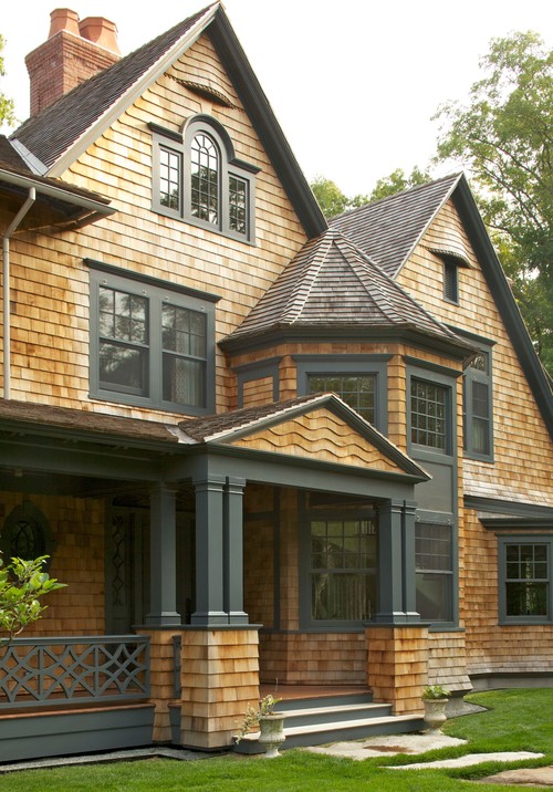
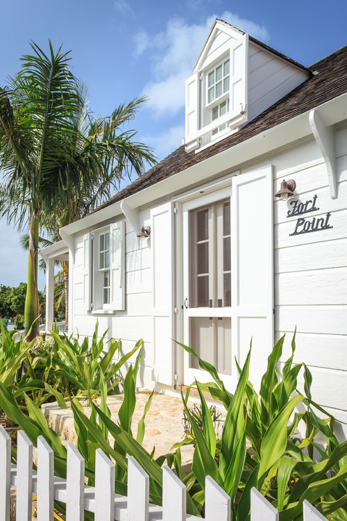
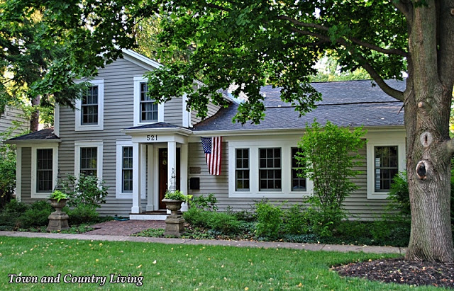
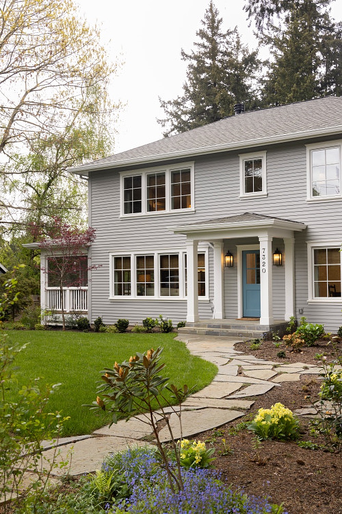
Today’s charming home tour is a shingle-style house from the eastern coast of the US. Shingle-style architecture was inspired by a love of Eastlake Queen Ann architecture and a renewed interest in Colonial American architecture. You’ll find this style among seaside cottages where these types of homes were constructed for affluent families. This particular home was decorated by interior designer, Heide Hendricks. I think you’re going to love today’s tour! The beauty of the home’s exterior hints at what’s to come inside each room.
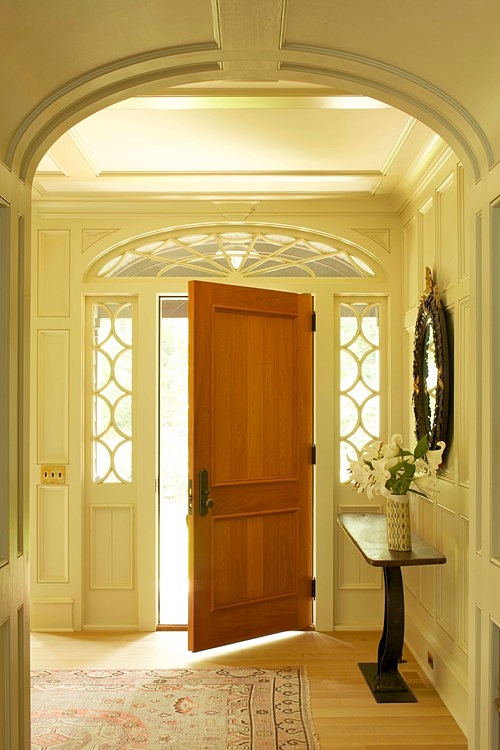
The stunning entryway leads you into the home where you’re greeted by an arched hallway and plenty of custom trim work.
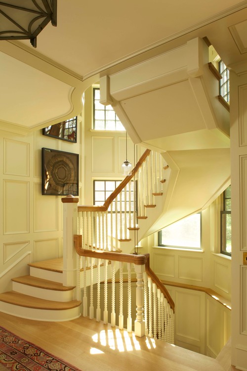
The winding staircase appears to float in its space. While I love the stairway, I just wish it didn’t block the windows. Even so, it’s pretty amazing.
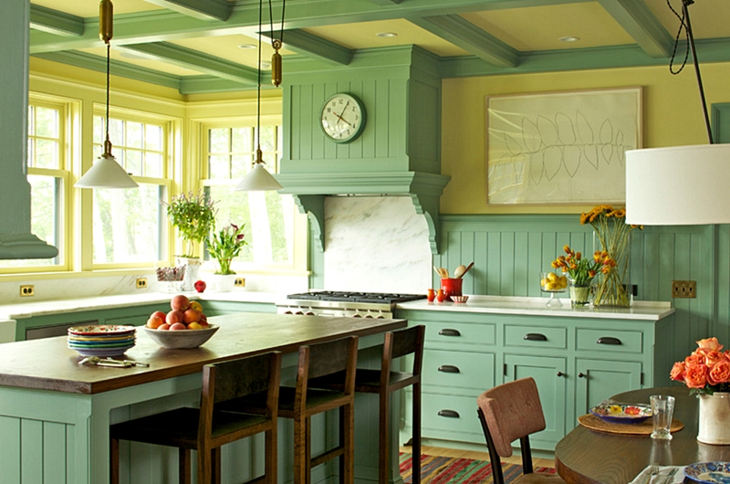
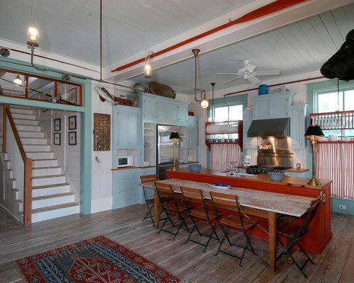
I’m in love with the kitchen area of this shingle-style house. I adore the color scheme, the trim work on the ceiling, the bay of windows, the decorative range above the stove, the light fixtures, and the kitchen island. If I had to choose a dream kitchen, this would be it!
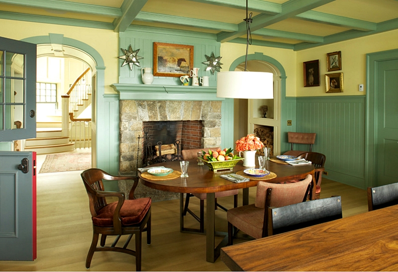
The dining area of the kitchen is equally charming with a beautiful stone fireplace. You can see that stunning staircase in the room beyond, and did you notice the Dutch door to the left?
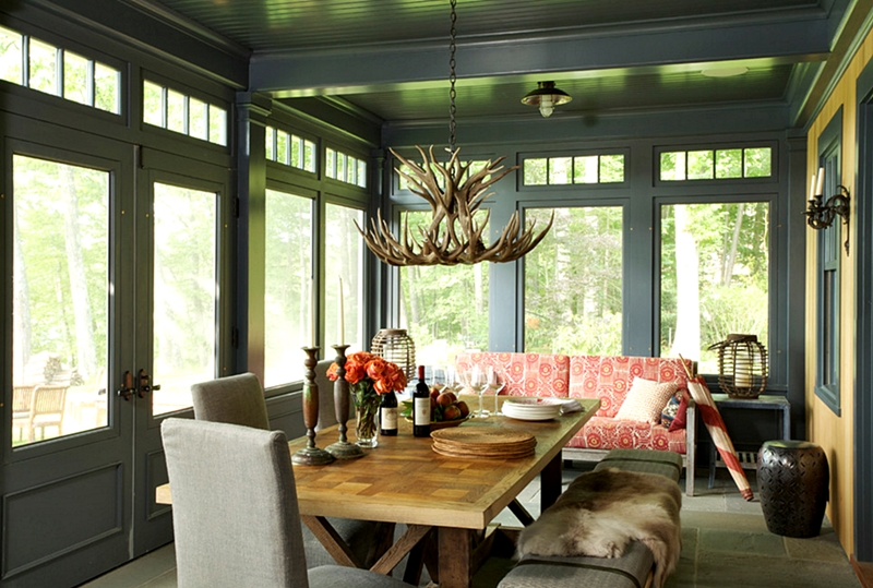
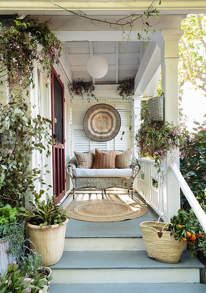
Out on the porch, another dining area awaits. The color scheme is soothing and calming, with just the right touch of red on the settee. Double doors lead outdoors and I imagine the views from this space are pretty spectacular.
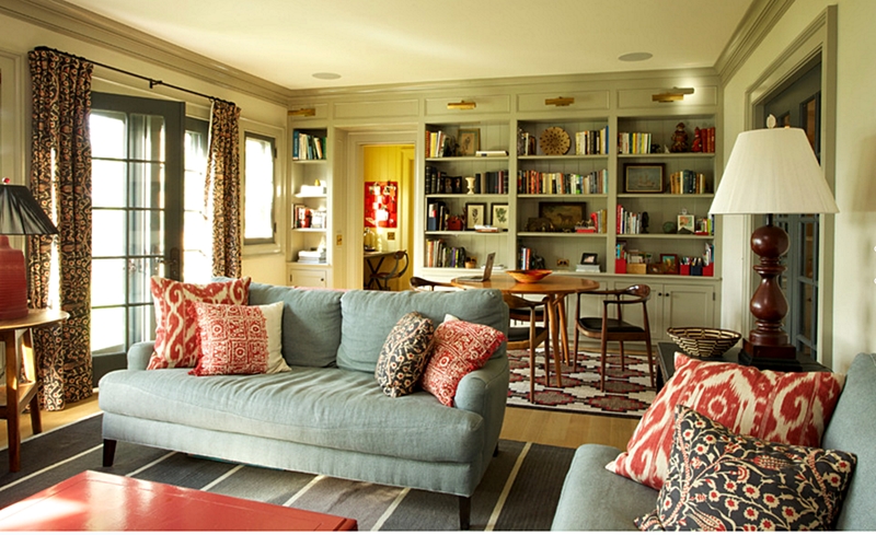
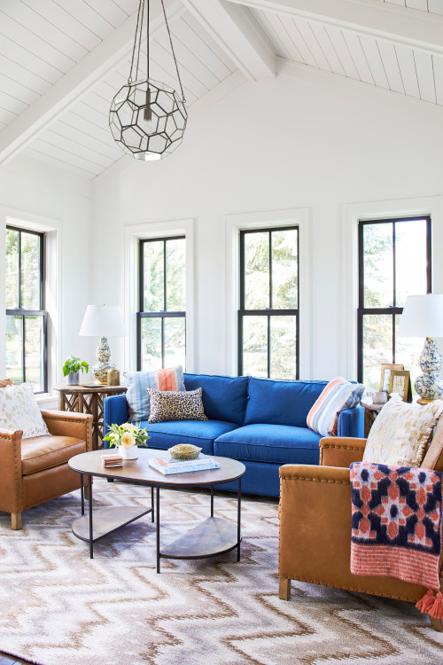
Although a shingle-style house with its East Lake Queen Anne influences might inspire most people to decorate more formally, I love that the designer kept the spaces casual, like this family room. Comfortable furniture pairs with pretty pillows and patterned drapes. A card table resides in a corner next to built-in shelves that could hold games as well as books and knick knacks.
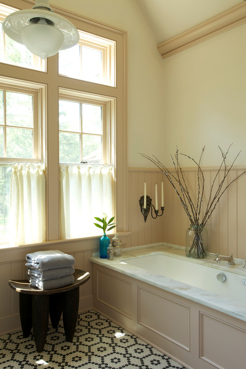
An expansive window lets plenty of light flood the bathroom. In this space, the trim is kept more subtle by painting it a creamy, darker shade than what’s used on the walls. The patterned floor lends a playful element.
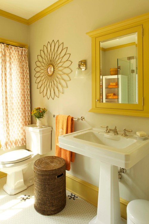
In another bathroom, the trim work is punched up with a vibrant shade of yellow!
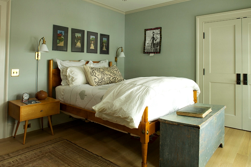
A primitive rope-style-looking bed takes center stage in one of the home’s bedrooms. The decor was kept to a minimum, which I think is wise so as not to compete with the simple bed.
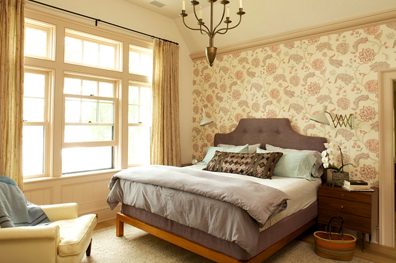
Wallpaper and a pretty chandelier grace this slightly more elegant bedroom. One of the things I love most about this shingle-style house is the abundance of windows and all the trim work throughout the home.
You can view more of the shingle-style house over at Houzz.
And you can tour more houses in my Charming Home Series!

Very nice! Love historic homes.
Beautiful home, Jennifer. I love the windows and trim also. It was a priority when we built our house. I just love the sunshine streaming through all the rooms in the house.
Hi – this is so beautiful and I really love your tours, and your blog
can you tell me why the google ads are in the middle of the screen and it makes it difficult to see the whole picture, I cannot seem to remove them. thank youn- Betty from Ontario Canada
I enjoy your blog soooo much! Thanks for all you do, but I agree with Betty; too many ads!!! This is a problem with the few other blogs that I look at. Great content but TOO MANY ADS. Boo hoo 🙁
Hi – I love your blog and your house tours – excellent – what I do not like is the advertisement in the middle of my screen that makes it very difficult to see it properly. I have tried in many ways to get rid of them but no success – any ideas?? Regards Betty from Ontario,Canada
What a most beautiful home!… love this series Jennifer!
I love the character of this home, and also the colors! It would be fun to live there.