You Don’t Want to Miss This Amazing Traditional Cape Cod Home
Today we’re traveling to the east coast once again to tour a charming, traditional cape cod home with timeless appeal. The interior designer is Katie Rosenfeld who enjoys using a colorful, eclectic approach to design and decorating. She uses patterns freely to creative comfortable, livable spaces.
A porthole mirror above the fireplace lends a nod to this home’s east coast location. A ticking stripe chair is a staple of coastal decorating style.
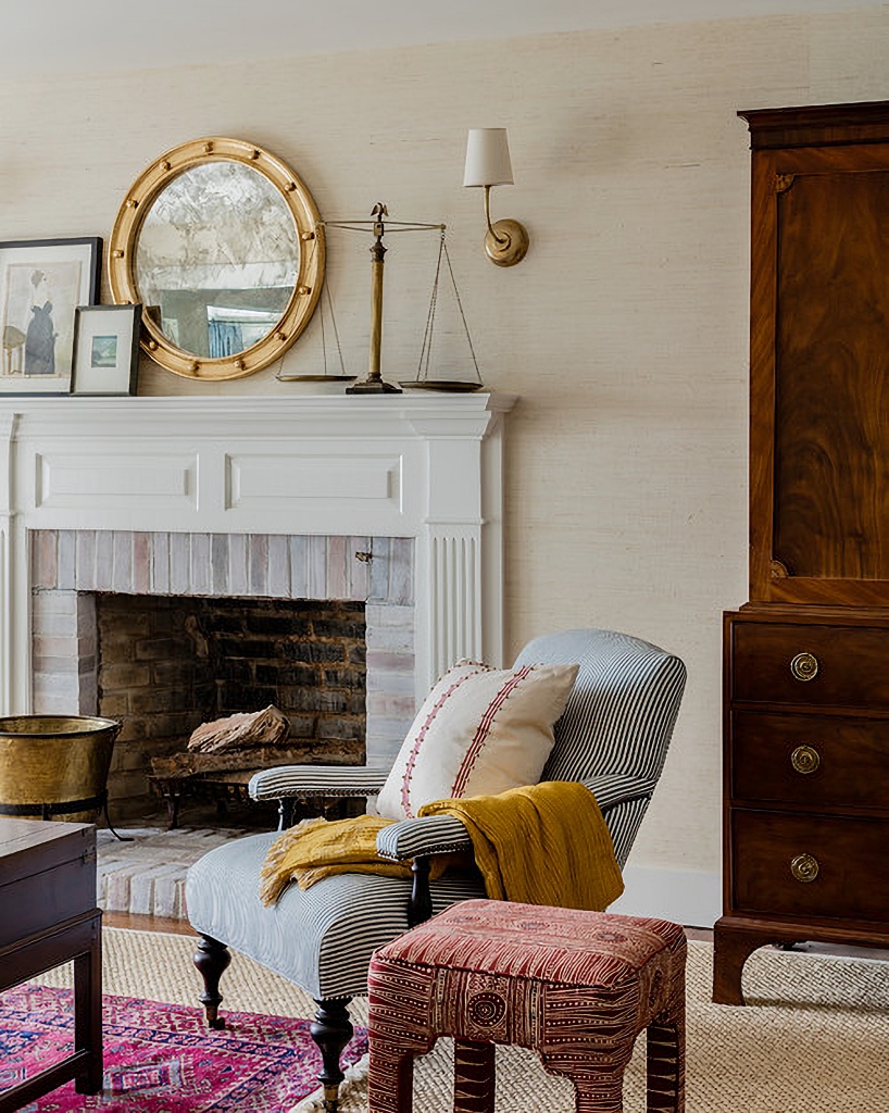 Photo by Katie Rosenfeld Design
Inside the front door, you’ll find a hint to the reds and blues that are woven throughout this cape cod home. A pairing of traditional landscape paintings echo the warm wood of the floor below.
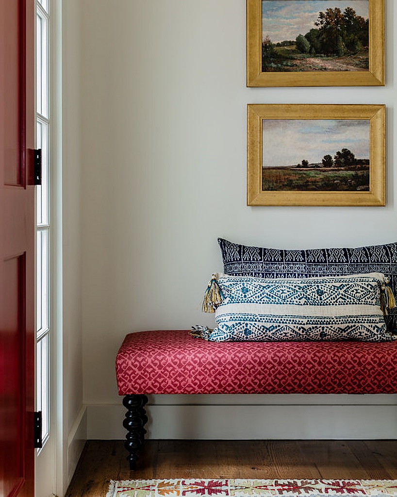 Photo by Katie Rosenfeld Design
The living room enjoys an amazing view out the expansive glass doors. A blue couch provides comfy seating while an oriental rug provides color and pattern underfoot.
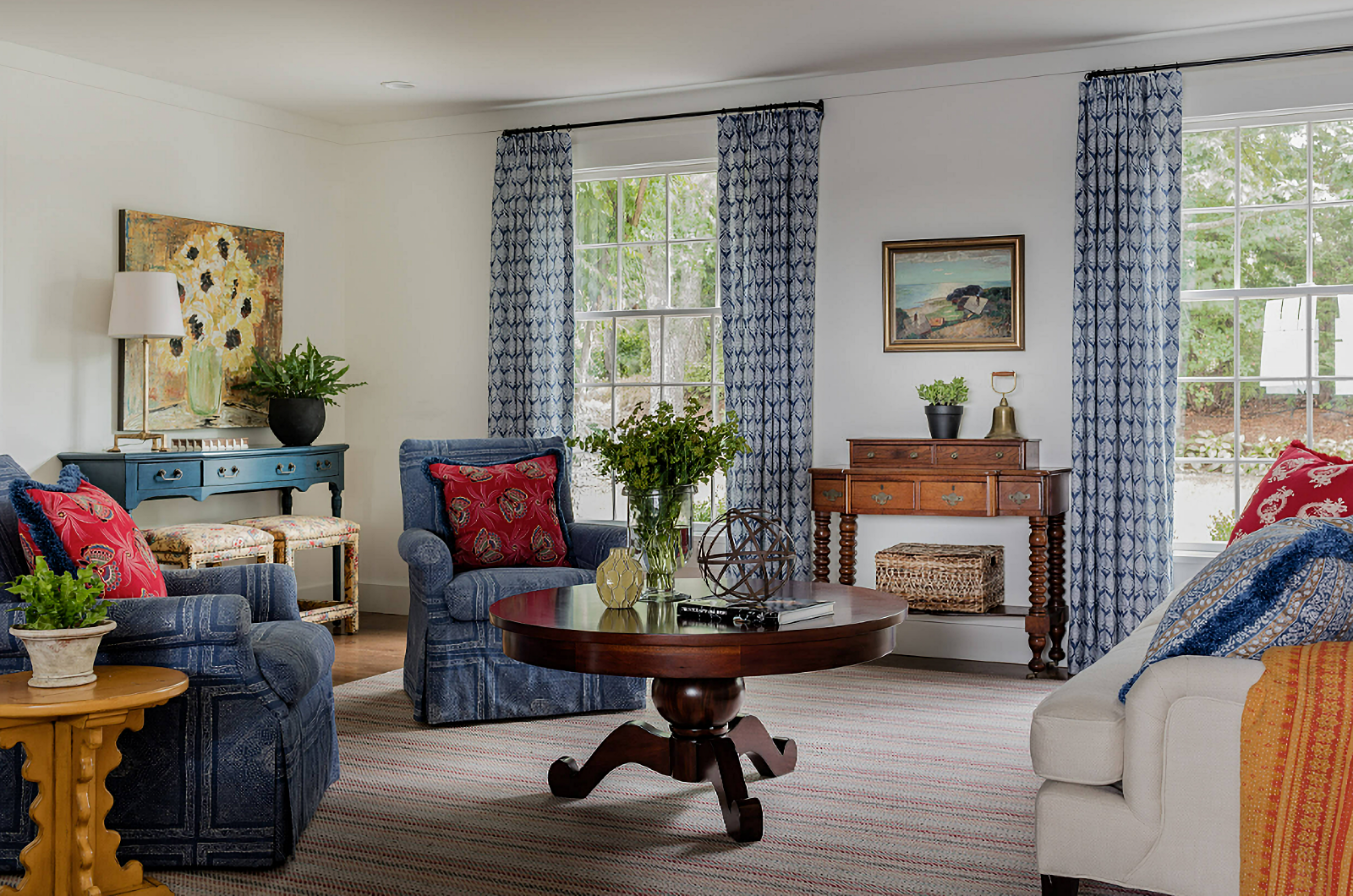 Photo by Katie Rosenfeld Design
It’s no surprise the Cape Cod home’s kitchen embraces traditional styling with custom cabinetry. Blue paint washes the room in coastal style while another oriental rug adds more color.
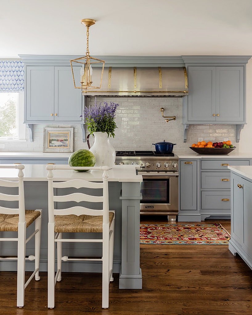 Photo by Katie Rosenfeld Design
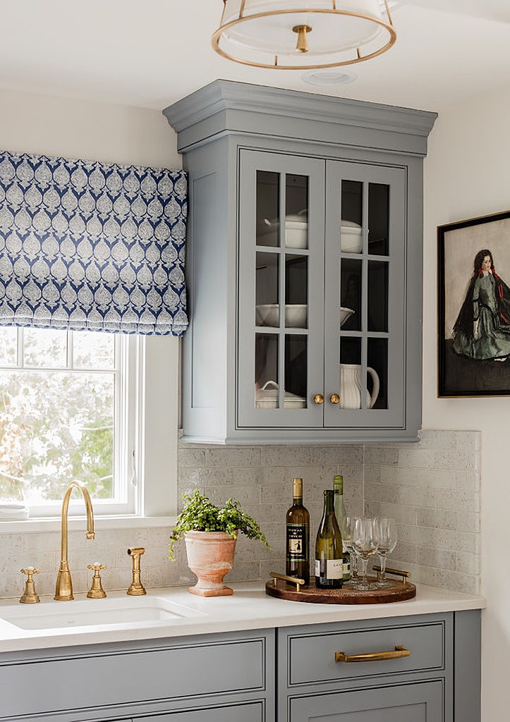 Photo by Katie Rosenfeld Design
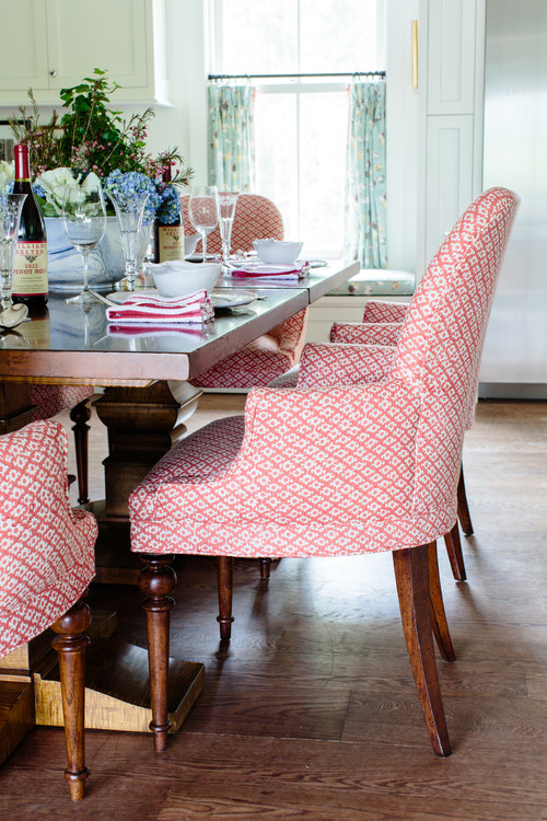
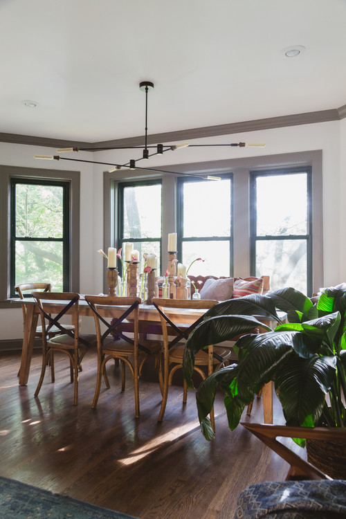
A cozy dining space is brightened up with color. Note the use of matching fabric on the pendant light and dining chair upholstery.
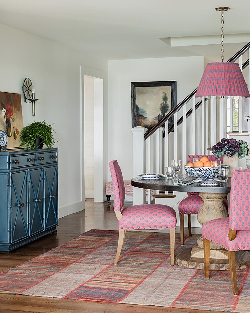 Photo by Katie Rosenfeld Design
I love how the designer incorporated traditional oil paintings throughout this cape cod charmer.
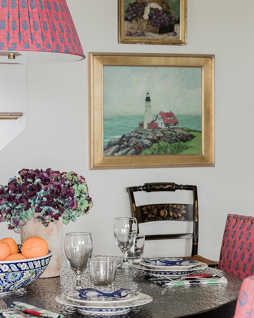 Photo by Katie Rosenfeld Design
I’m in love with the wallpaper in the living room.
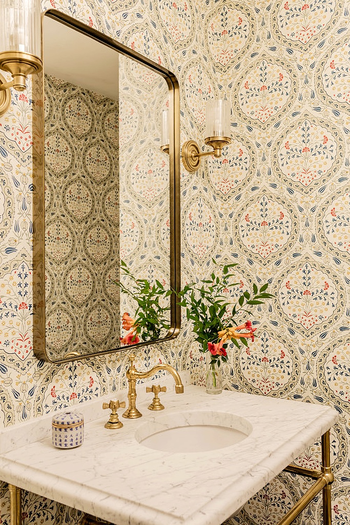 Photo by Katie Rosenfeld Design
A cozy nook provides a quiet place for reading or doing crossword puzzles.
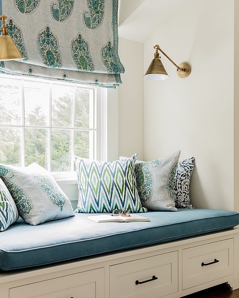 Photo by Katie Rosenfeld Design
An elegant tub enjoys an expansive view.
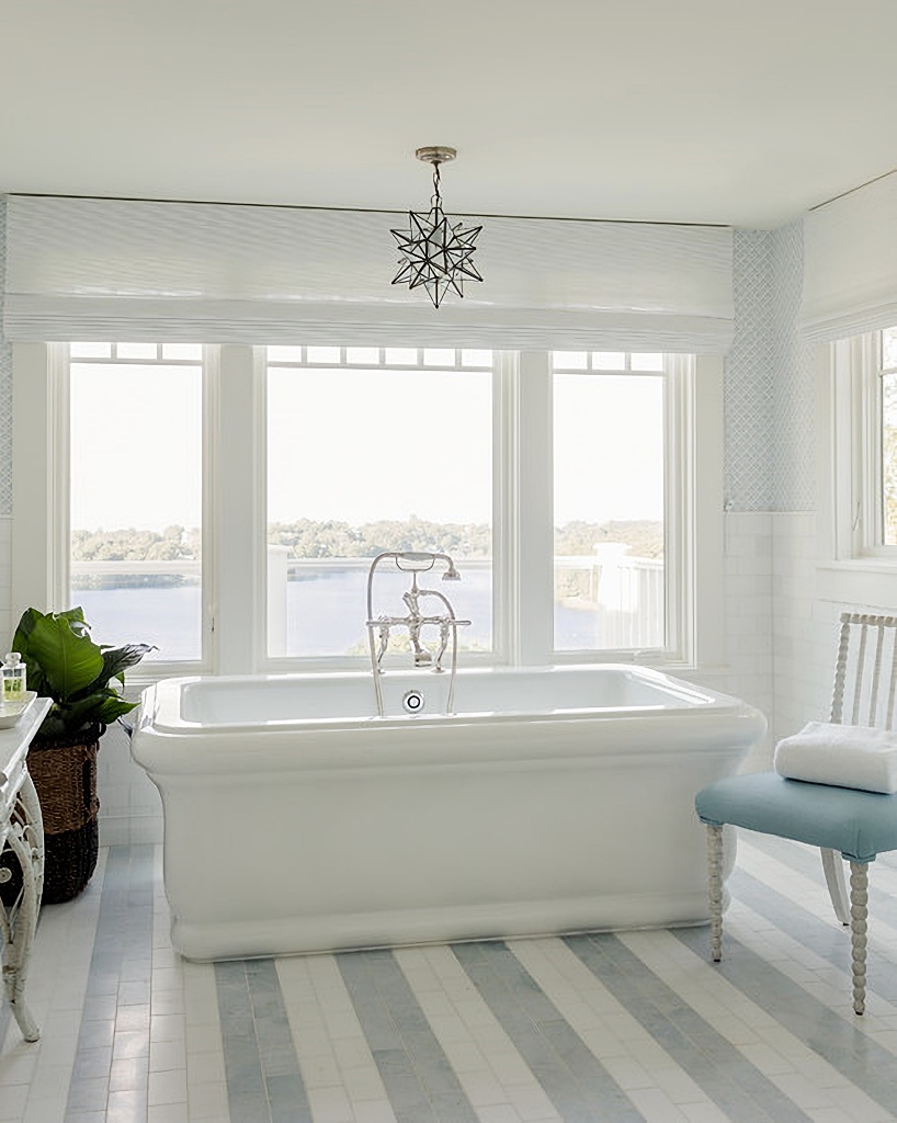 Photo by Katie Rosenfeld Design
The bathroom vanity sports louvered doors while a soft patterned wallpaper adds interest to the walls.
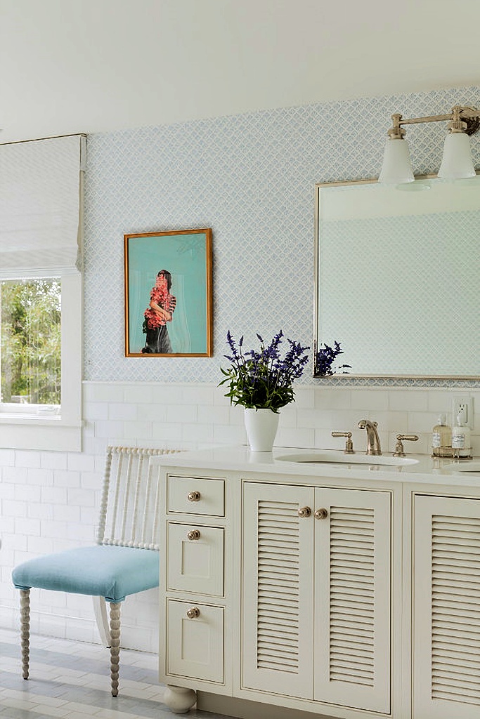 Photo by Katie Rosenfeld Design
Wallpaper appears in another bathroom graced with classic subway tile
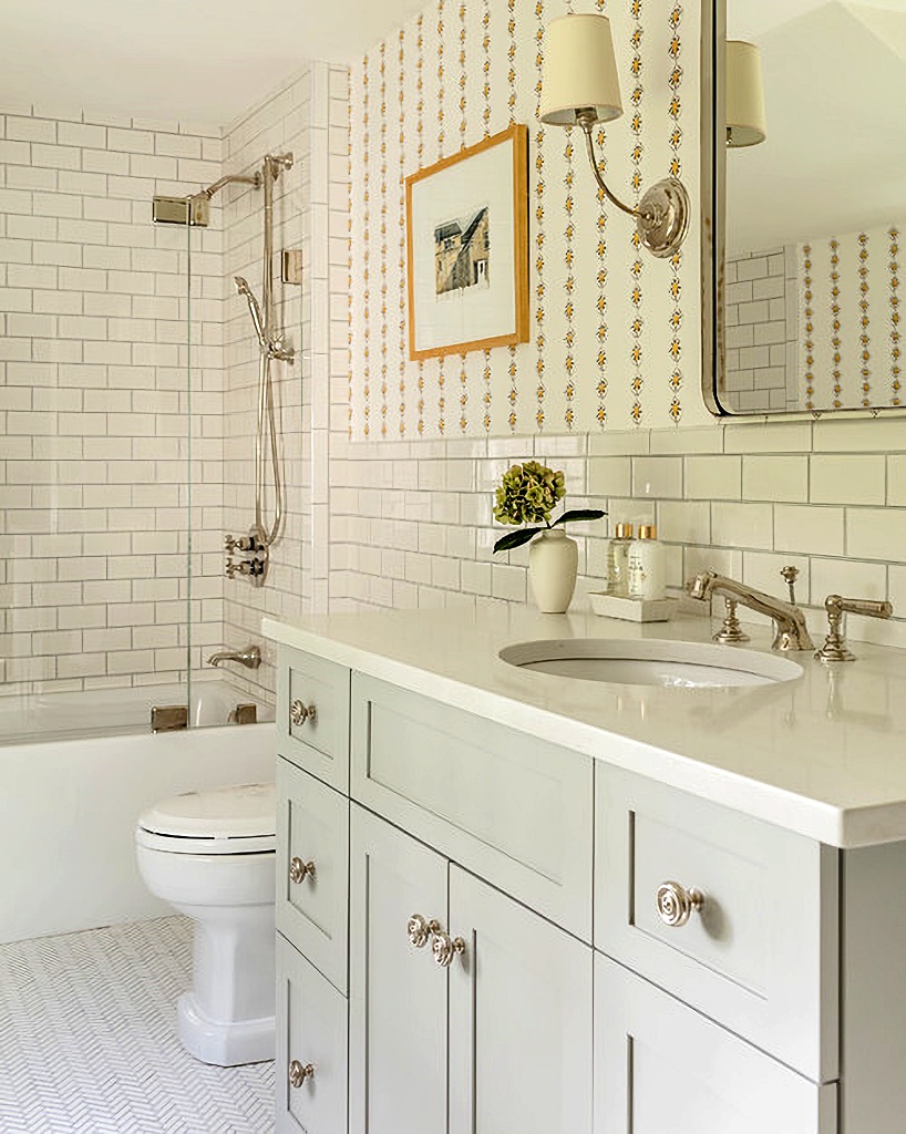 Photo by Katie Rosenfeld Design
Blue and red make their way into the bedroom, which also has a fantastic view out the glass doors leading to a deck.
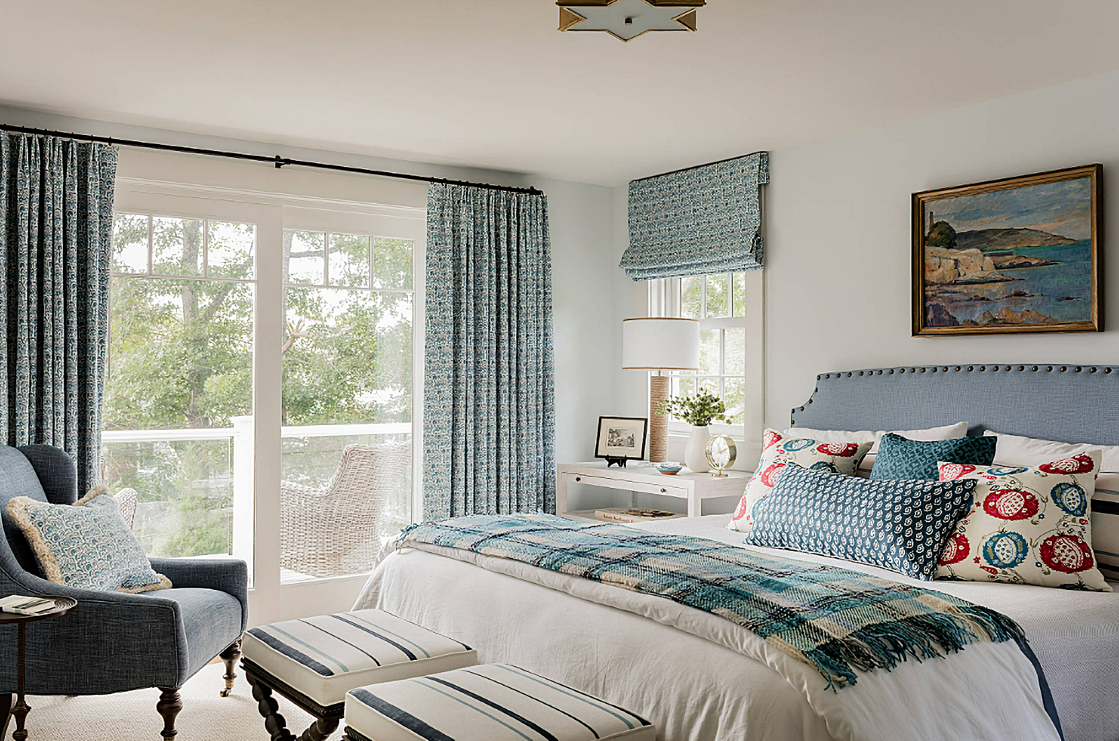 Photo by Katie Rosenfeld Design
A smaller bedroom enjoys cozy charm with a beautifully vintage metal bed and a charming star light on the ceiling.
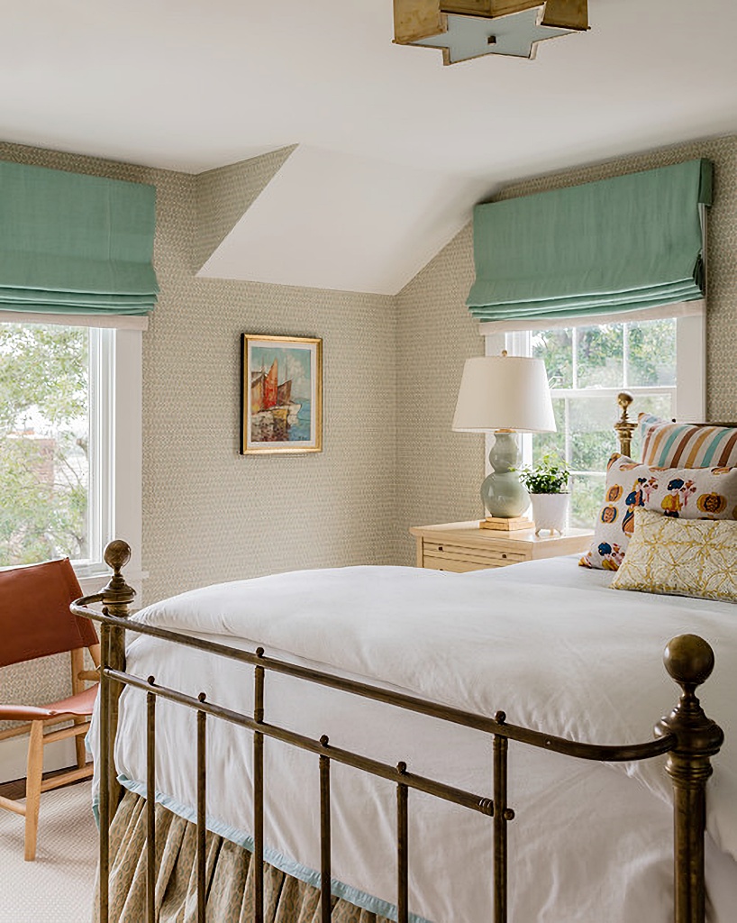 Photo by Katie Rosenfeld Design
Painted pieces throughout the home keep a casual, comfortable vibe going.
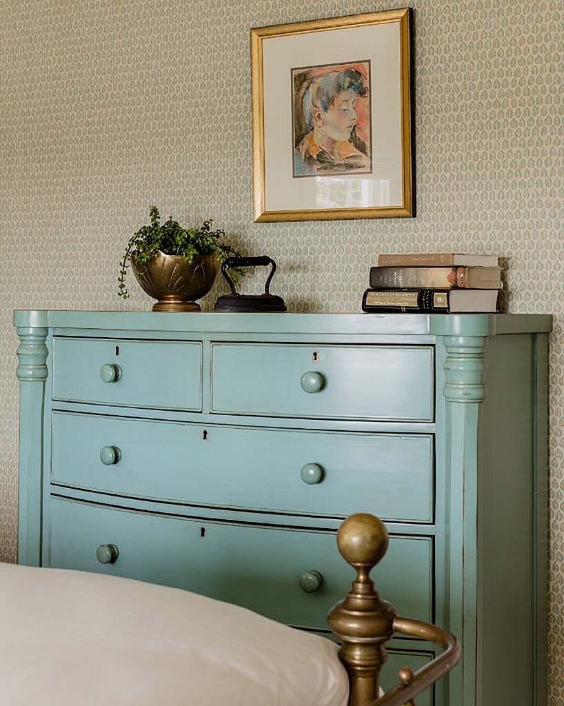 Photo by Katie Rosenfeld Design
The home’s exterior features classic Cape Cod siding and a welcoming red front door. A whimsical flagstone path leads to the red brick porch with a pergola overhead. Soon that trumpet vine will create a makeshift porch roof.
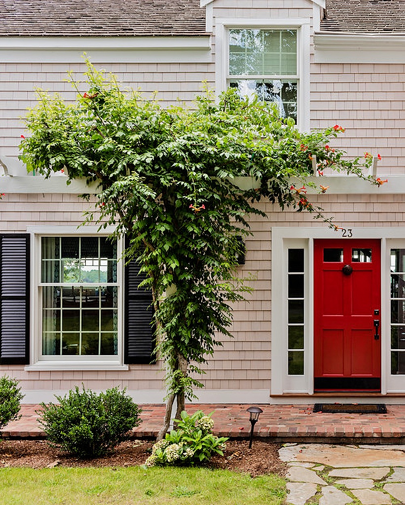 Photo by Katie Rosenfeld Design
See more photos of today’s traditional Cape Cod home by Katie Rosenfeld.


Love your home tours, Jennifer. I usually can get at least a spark of an idea from every one of them – being able to incorporate those sparks into my own home is a different story altogether – but thanks for posting.
Love this house. Blue and red are such a hit.
Love this house. Blue and red are such a hit..
Lovely home and there were some great paintings. The views were the best feature, i could set and dream for hours looking outside.
Love the home tours. This one was a bit too “unmatchy” for me. 🙂 Keep up your good work though!
Such a stunning house! I love how they incorporated touches of blue in every rooms home decor and each room has blue in a different way.
Wow, that’s my kind of home!
What color of blue is used for the kitchen cabinets? Beautiful!
Finally!!! …. finally, I’m seeing a home with character and no “cookie-cutter” decorating inside! Thank you! I just finished viewing a group of popular bloggers who assembled a Spring 2018 House Tour and while they have nice homes, nearly every single one looked the very same!! Then, I came upon your refreshing post that has individuality and actually shows book bindings … what a shock! Nearly every blogger has either covered their books in burlap or turned the books around so you can’t see the color of the book’s binding or (worse!) … the title of the book. Yes, I understand the goal is to keep the room neutral in color and avoid any offending green, red book or (horrors!) orange book spine but, to me, it looks pretentious and just plain silly. Old books with their beautiful dark colors, or gilt lettering or page edges, etc. add so much interest and character to a room and tell a little about the homeowner’s personality and personal interests. Other copy-cat decorating is the typical strawbag hanging on a hook filled with flowers or (in cooler months), deer antlers. I always loved the color, aqua, but nearly every blogger uses that color in pillows, throws or mason jars; when that happens, I put away items in that color until it becomes less popular. I want my home to not be the same as everyone else’s. Again, I like deer sheds, the color, aqua, and also like straw bags BUT I also crave individuality and character in a home. Thank you so much for providing that in these lovely rooms.
Gosh I agree with EVERYTHING that Elaine said about decorating a home!!! She is right on point!!!! Sandee.
Love this home. Thanks for always giving us beautiful homes and gardens
My favorite is the star ceiling light, but all the light fixtures fit the room
Just perfect!
Thank you Jennifer for this post. I especially liked the kitchen in this home. I pinned several photos for my future decorating projects!